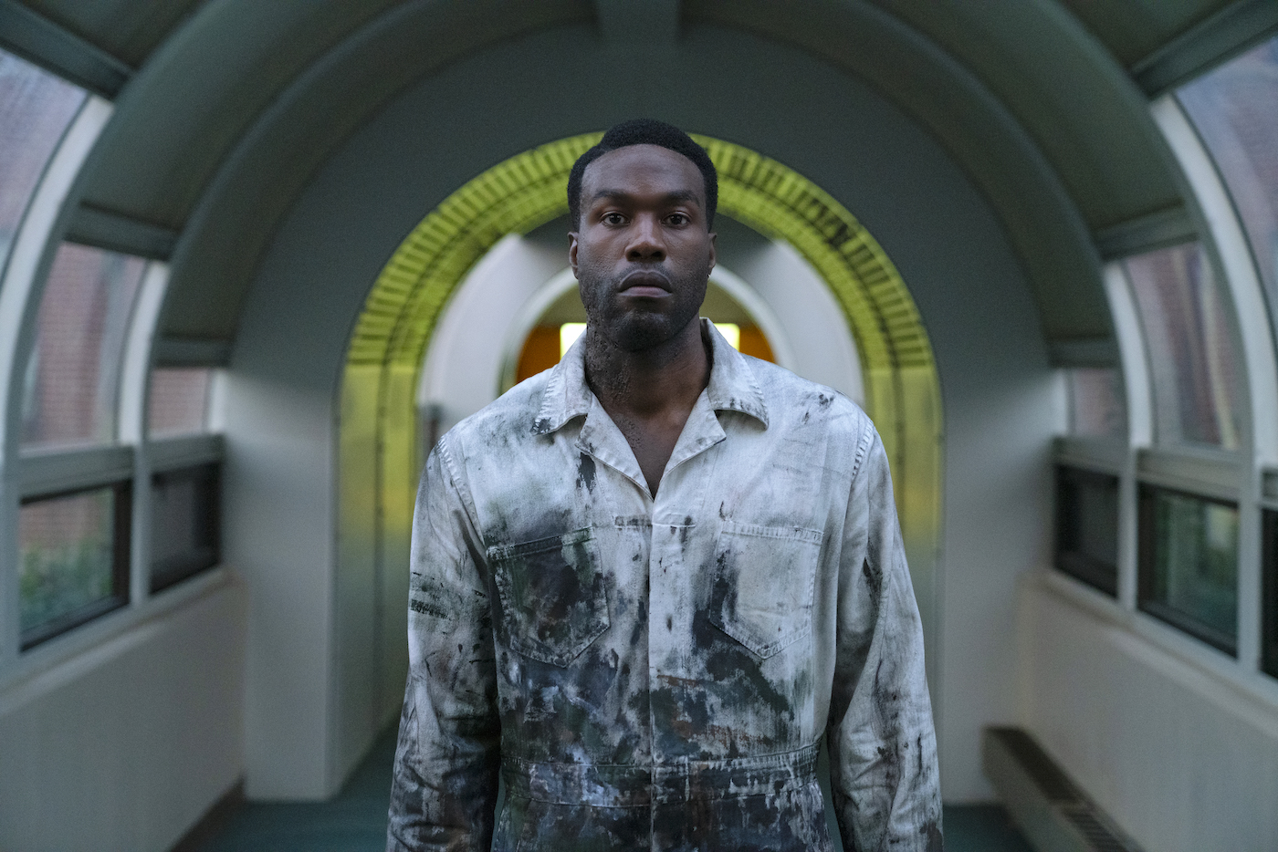
John Guleserian helps give Chi-town “the hook” in an updated retooling of the early-90’s classic, Candyman.
by Kevin H. Martin / Photos by Parrish Lewis / Universal Pictures/MGM
Candyman (1992), directed by Bernard Rose, transplanted Clive Barker’s story “The Forbidden” from the U.K. to contemporary Chicago, and deftly tapped into long-simmering racial disparities in one of America’s biggest cities. Shot by Anthony B. Richmond, ASC, BSC, the film spawned two sequels and transcended genre limitations with equal measures of biting social commentary and gritty visual poetry. A later attempt to film a Candyman/Leprechaun crossover was rejected by star Tony Todd, and subsequent sequel efforts became mired in issues dealing with film rights.
Universal’s new Candyman (shot in 2019 and delayed due to COVID) was directed by Nia DaCosta and produced by Jordan Peele, both of whom co-wrote the screenplay with Win Rosenfeld. This new version updates the yarn, focusing on Anthony McCoy (Yahya Abdul-Mateen II), who was a child in the original film used as bait by the serial-killing supernatural manifestation of Daniel Robitaille, a 19th-Century African American slaughtered for daring to have relations with a Caucasian woman.
With only four weeks of prep, Director of Photography John Guleserian says he hit the ground running. “Those were seven-day weeks,” he recalls, “beginning when I jumped off a plane and directly into a scout van with Nia and the rest of the team. Fortunately, our brilliant production designer, Cara Brower, had already lined up most of the locations. Cabrini-Green is where the original was set, and it was essential we shoot there again, even though the area has changed drastically in the last twenty-five years.”
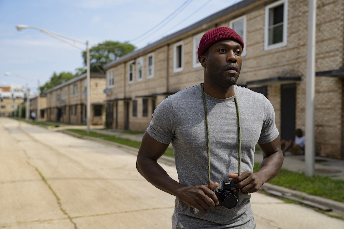
“When I came on, the screenplay was not yet locked, so there was some flexibility on where scenes might be set,” Bower recounts. “We wanted the film to capture the full contrast of the new developments in Cabrini along with what remains, which isn’t much, but are haunting remnants of a community that has been abandoned and pushed out. Nia wrote a lot of these settings into the script once we started scouting.”
One location Bower wanted in the film was the Northside Stranger’s Home Church – one of the few buildings standing from the era of the first film. “It was once situated amongst the towers and painted by a famed African American muralist, but now it stands starkly alone painted a flat gray,” she continues. “It took weeks to track down the owner, remove the mold inside and shore up to the floor to make it safe for shooting, but it was worth the effort. I hope that its inclusion is a worthy tribute to the building as it’s slated to be demolished.”
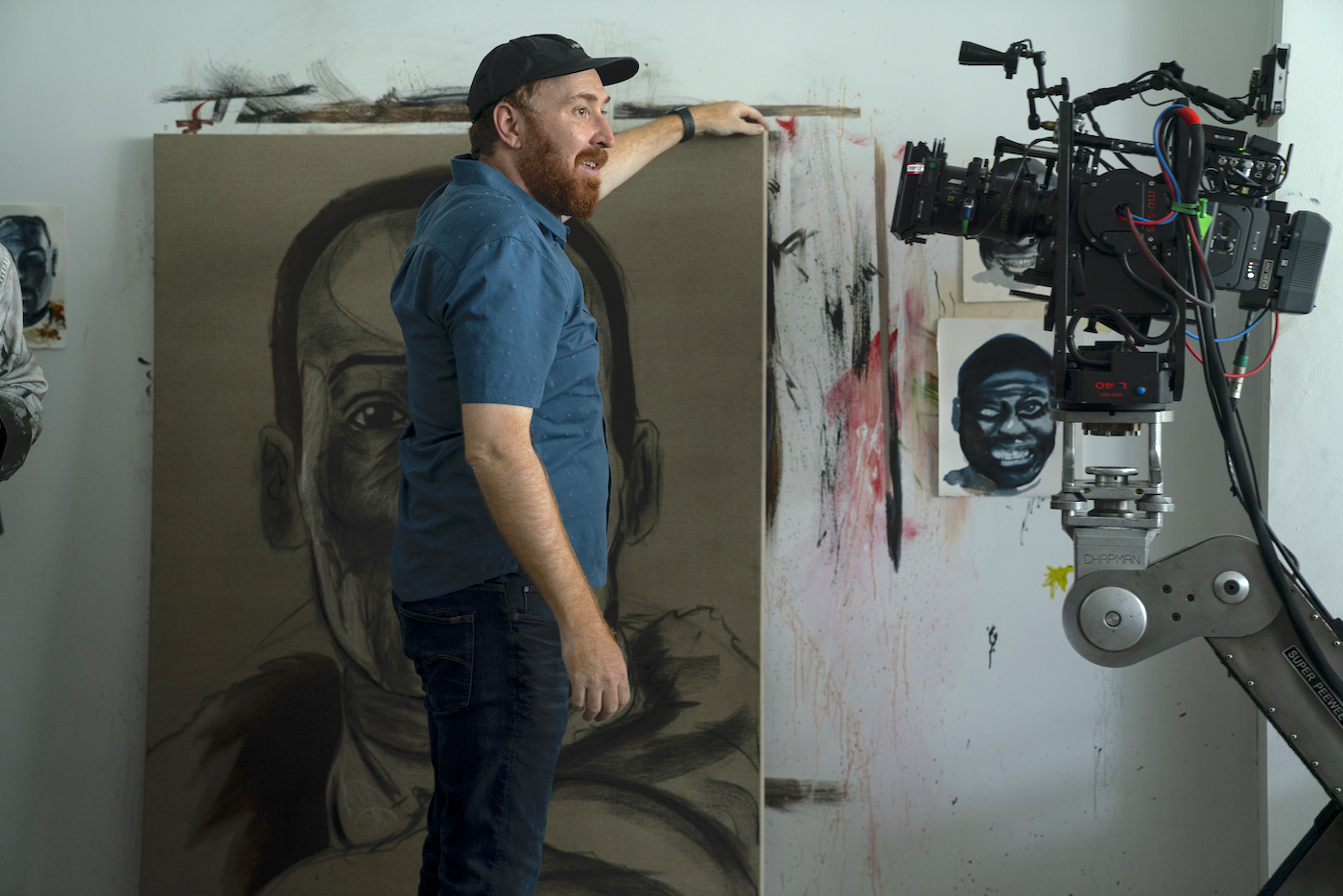
Brower, who read a history of Cabrini-Green called High Risers to help determine the geography of the past landscape calls the original film “fascinating” – using a neighborhood famous for racial injustice as a setting for horror, and by extension, social commentary. “Using real locations helps ground the genre/fantasy elements,” she adds, “and I was determined to find locations in the real Cabrini area. For Brianna and Anthony’s apartment, we found a new luxury loft, built on top of an old historic warehouse, that was just a few blocks from where the first film was shot. The balcony in Anthony’s art studio literally looked out onto the field where the towers once stood. It really helped us all get into the mindset of the story.”
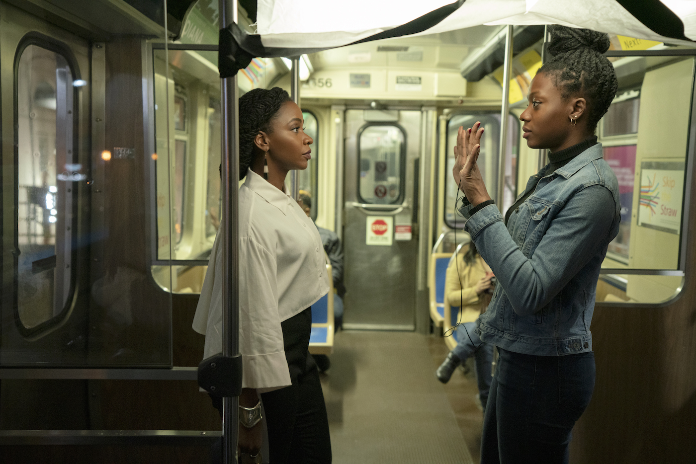
DaCosta relied on storyboarding and previs animatics, the latter handled by Plot Point 1. As Guleserian points out: “Nia came in well-prepared, and the animatics were helpful for anything needing VFX. Candyman often appears as a reflection in windows and mirrors, rather than as a physical presence, so the specificity that previs offered proved invaluable.”
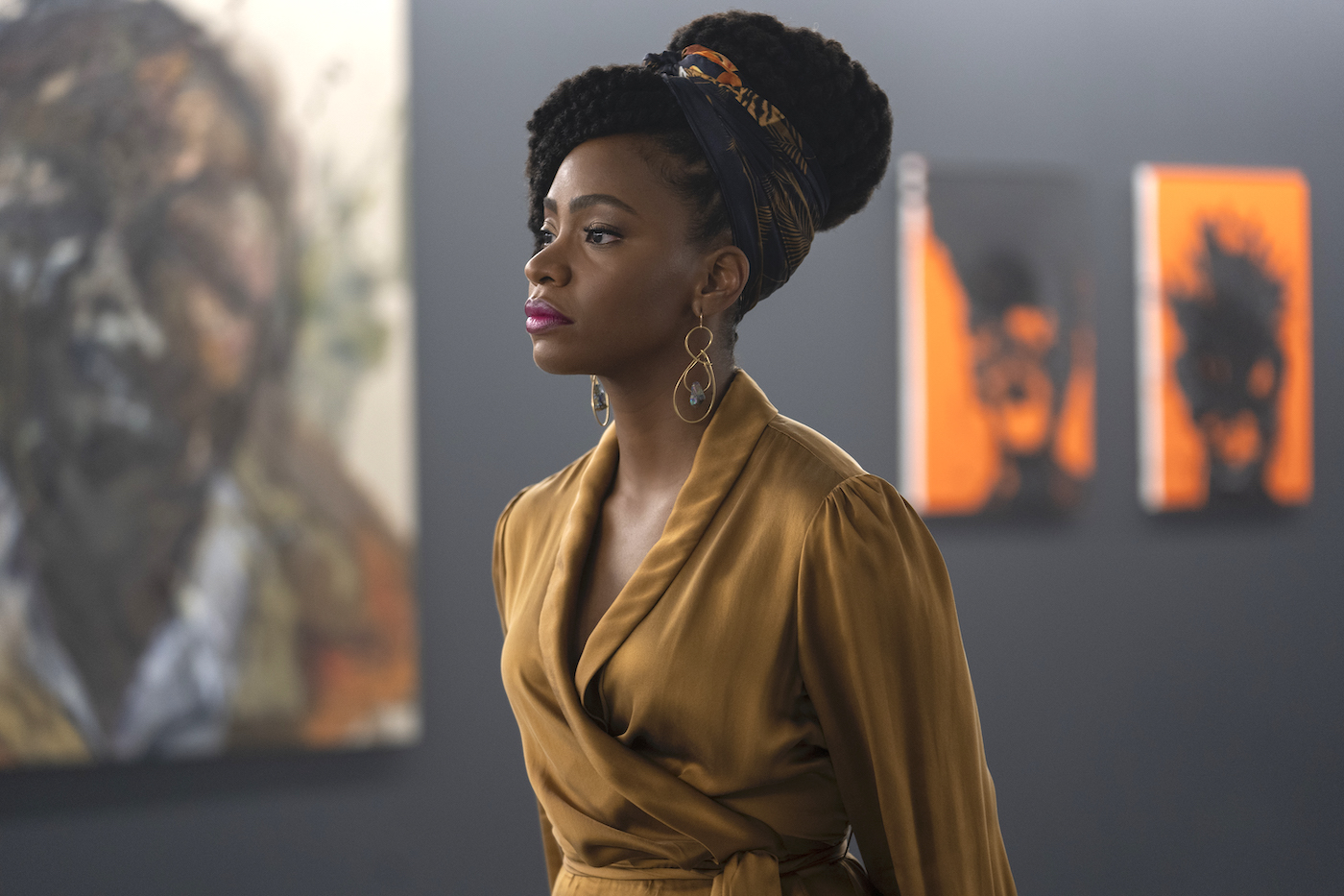
The film contrasts the squalor of urban decay with the upscale look of the art world. “Much of the movie is set in art galleries,” Guleserian continues, “and the various works on exhibit included both original pieces and pre-existing ones. I did want this to be a colorful movie, which you don’t often see in low-light genre work. But our colored lighting was always motivated; for example, in the gallery, there’s a prominent piece of neon art driving the color. I wanted to make sure the art appeared in the movie just how it did with my eyes in person. So, my camera, lens and lighting choices supported that goal.”
The bulk of shooting was done with ALEXA LF. Guleserian reports that “during our limited testing in a rental house, I found something special in the new ARRI Signature Primes. They felt contemporary without being too sharp and surgical. The color separation in each lens looked a bit different from anything else I’ve seen due to the new LPL mount, which allows the glass to sit closer to the sensor. Chromatic aberrations around the edges have been virtually eliminated. They’re also well-designed for human faces – flattering whether you’re on the longest lens or the widest in the set.”
Since matching zoom lenses was not yet an option, ALEXA Minis were sometimes deployed. “We had a shot that took us across the city using the Angénieux 24 to 290 millimeter, which let me start wide and end very tight,” adds Guleserian. “We also had an 18-to-85-millimeter Fujinon for when I had to shoot at F2, because I was inside a building with tinted windows to get the proper vantage to capture Chicago’s corn-cob buildings.”
In establishing the film’s look, Guleserian worked with his regular collaborator, Company 3 colorist Natasha Leonnet. “I put together some reference images from photography and movies, just to get a conversation started about the look for the movie and for figuring out how I was going to shoot it,” he shares. “Natasha came up with a single-show LUT, which is nearly always my preference, that reflected those attributes.”
As DIT James Notari adds: “That LUT created by Natasha was about 1.5 stops darker than what we were seeing, which is what John wanted to protect the RAW. We shot predominantly at night and with a largely African American cast, and that worried MGM, after reviewing dailies from a night interior scene. Although the dailies looked great, MGM was worried the ARRIRAW negative might be too thin to work with in post down the road. I just had to send them the LUT-less stills of the shots.”
Notari’s cart included a pair of Sony PVM A250 25-inch Sony monitors. He used Pomfort LiveGrade to effect corrections before Technicolor processed digital dailies using Colorfront Express Dailies. “Nia started production while watching from village, but soon wound up at my monitors alongside John, and there was a meeting of minds between them,” Notari recounts. “Nia had done other projects, and this was her second feature, so she leaned on John. There were a lot of oners planned – not all on Steadicam, some were zooms – requiring many camera tests to work out details for some tricky shots.”
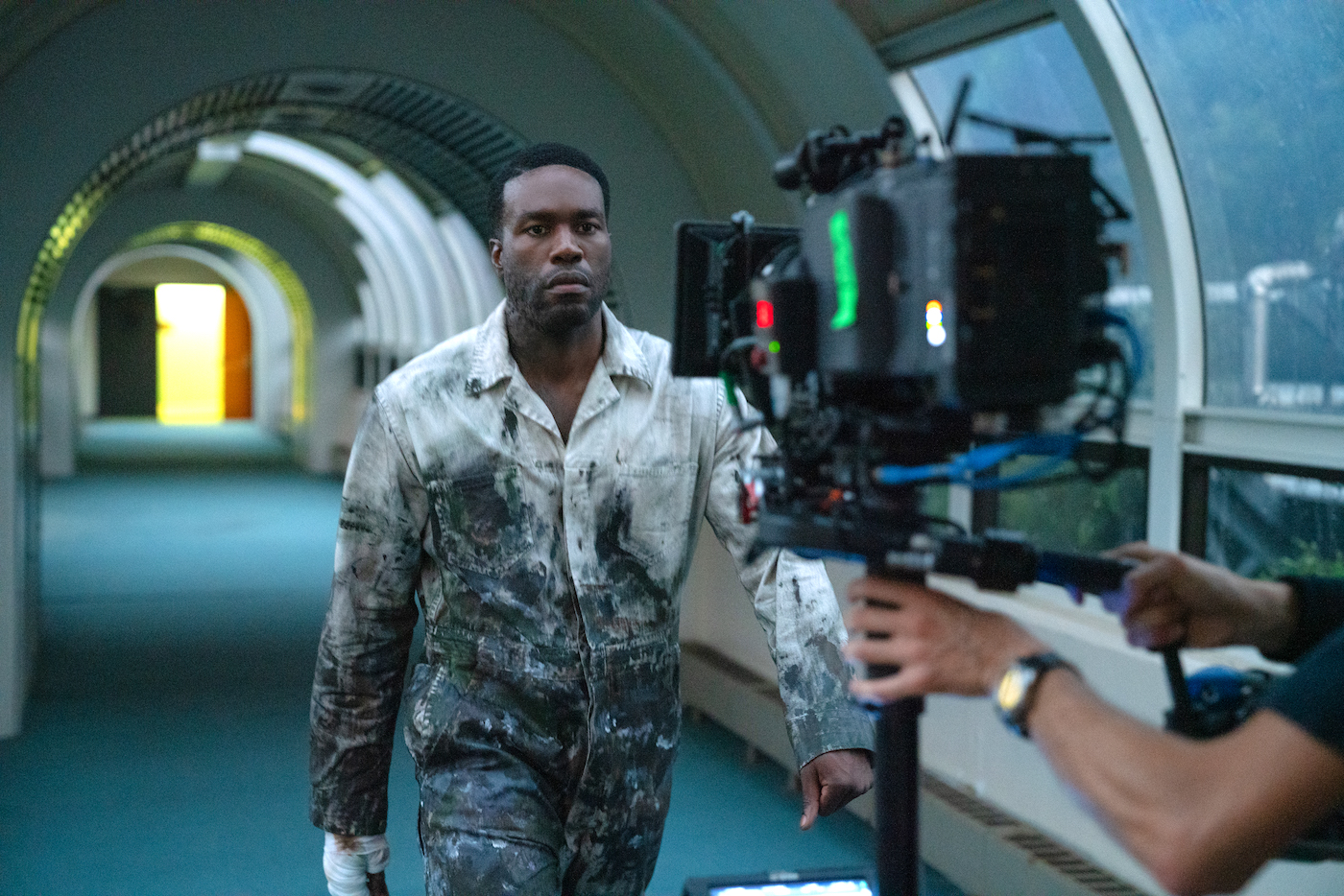
Candyman’s camera team included many Chicago locals, many of whom had either known or collaborated with Guleserian. “It’s a big anxiety-reducer to crew for someone you’ve already worked with, both for ease of understanding and just the joy of it,” shares A-camera/Steadicam operator Michael Fuchs, SOC. “I liked how John made use of Chicago, being unafraid to shoot close-ups on wide lenses, which helped make these characters part of that landscape. The most visceral memory for me was getting to shoot a long, slow zoom as we follow a character crossing a bridge over the river.”
B-camera operator Scott Thiele says the plan, initially, “was to make a single-camera movie, because everybody knew Michael could execute whatever was asked of him,” the Chicago native states. “But when time became an issue, we leapfrogged ahead, shooting with two cameras. Often that was for key moments that could be helpful in Editorial. The work was usually very wide or quite close, so a lot of times the truly difficult work would fall to my focus puller Hunter Whalen and A-camera 1st AC Jason Bonner, who both did a great job. Night interiors, if not shot wide open, were usually within a third to half a stop away.”
Whalen [ICG Magazine December 2019] relied on the Preston Light Ranger, a system he says is becoming almost necessary with large-format sensors, “given the shallow depth of field,” he states. “It was my first time using it, and I was skeptical at first but learned to appreciate having an intuitive system right there on screen. John was pushing us to get it because of a previous show he had done. Combining that with more traditional methods of getting marks helped to get the job done even at a nearly wide-open stop.”
Guleserian says he never felt beholden to use the camera in a clichéd “horror movie” fashion. “I always think that camera movement has to aid in telling the story and/or conveying the emotion of the moment,” he declares. “We wanted to avoid arbitrary camera moves, as the story, not the genre, was the driver. Any preconceived notion of how things are supposed to look just because it is a horror movie would impact that. There are useful storytelling devices to carry forward, but I’m not going in with the mindset that it is going to be shot this way just because that’s how it’s always been done in horror.”
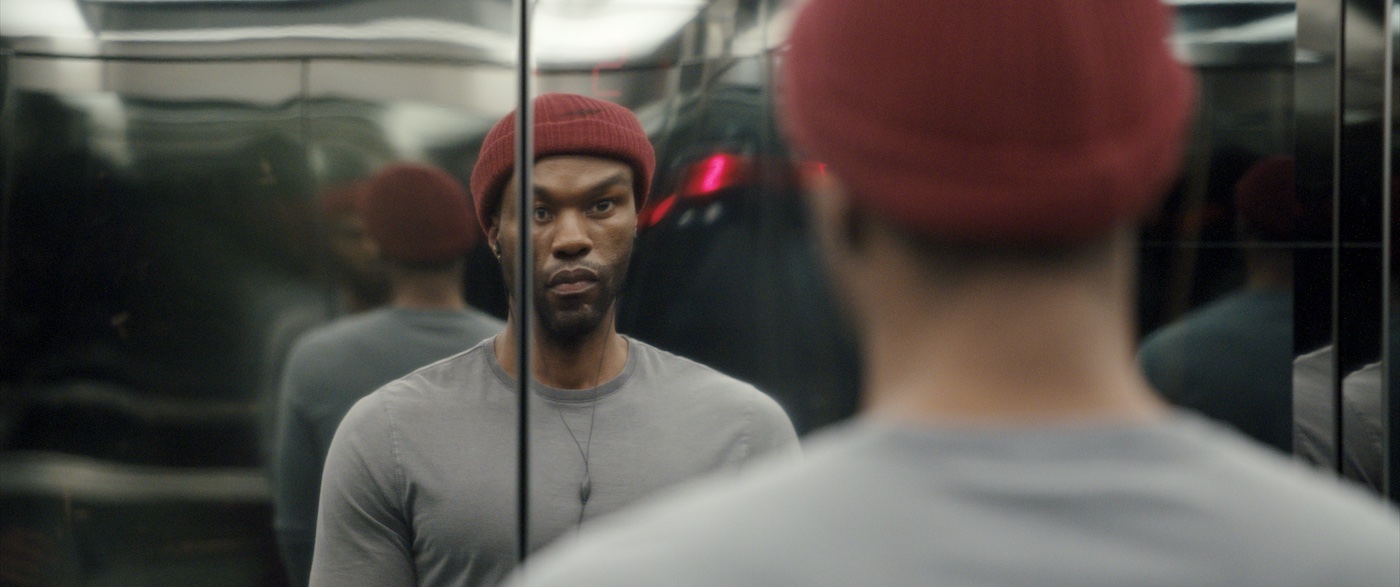
A mix of lighting types and temperatures was made clear during location scouting, “so we had to pay attention to our street lighting practicals,” Guleserian describes. “Most places have converted to LED – which itself can be inconsistent – so I was forever trying to bring things back to make them photographable. We began with the preexisting fixtures on location, replacing bulbs in many instances. Sometimes a particular color would work better, so we’d use amber for restaurant scenes, which set those apart from the gallery work.”
Guleserian’s naturalistic approach to lighting clicked with Chief Lighting Technician Addae Shelby, who says he enjoyed lighting the old Cabrini-Green scenes. “There’s a nighttime scene where the area had these older-looking fixtures,” he recounts. “We took a bunch of our fixtures with that old metal-halide look, then retrofitted them with clear daylight LED bulbs, installing them up and down a full city block, augmented with some SkyPanels on the roof. The funniest part was that while talking to the UPM, I found he thought we didn’t have to do any lighting that night, since there were no Condors. I was like, ‘Oh, really?’ and told my dimmer operator, ‘Go black.’ The whole area went dark.”
The art gallery build incorporated lighting from previs, which Guleserian says was necessary “because of a complicated scene in which all of the art was placed in 3D space. Some of it was reflective, and other pieces had specific light interactions, so addressing all that in previs helped us work through any difficulties during the shoot.
“The gallery sequence also required intense collaboration with other departments,” Guleserian continues. “We had to light it as an open gallery and one that was closing – house lights ‘on’ and ‘off.’ There were moments when you needed to see characters reflected in windows or in the art itself, and those choices needed to be motivated by the room and the installed art. There are art projections that work in conjunction with reflective art, and one prominent piece made of neon. It was a true team effort with production design, costuming, VFX, lighting, and the brilliant choices made by Nia. We had an additional projector using the same piece of art to light the characters as well, which pushed a bit of soft light that felt like it was coming off the art installation and formed the base level for our lighting.”
Shelby’s lighting crew worked with the art department on various interior fixtures, “so John’s camera wouldn’t have to avoid shooting them,” he explains. “There are mirrors everywhere in this movie, so if you want to shoot 360 degrees, it’s a factor. Occasionally VFX had to paint crewmembers out of shots, but it never happened with any of our lights.” For additional control, most of Shelby’s lights, including florals, were installed on switches, and could be controlled with RatPacs. “That let us treat most locations almost like stage work,” he adds.
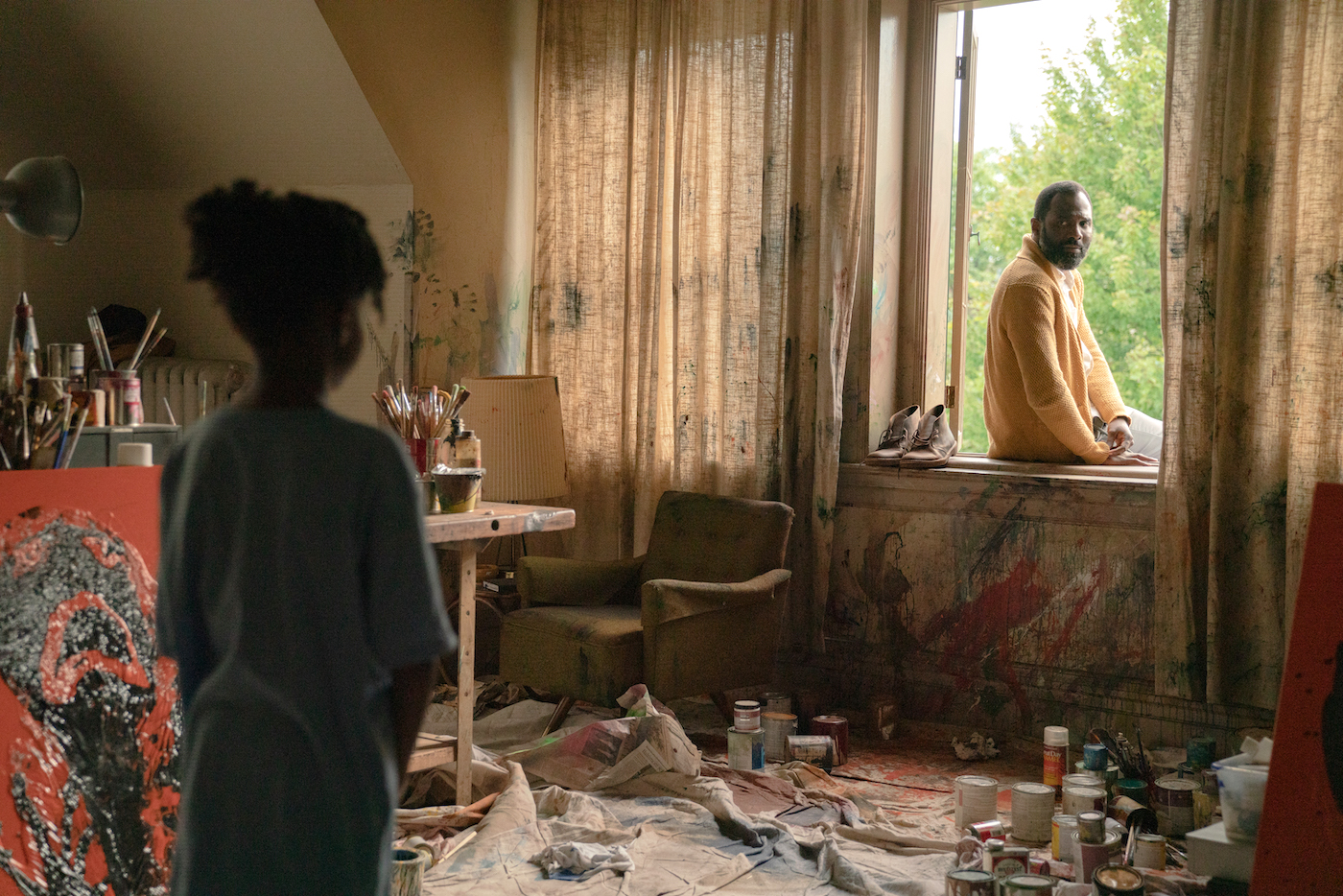
Although the majority of Candyman was shot on location, there were a handful of stage sets, i.e., the art gallery was a complete build on location in an empty warehouse. “We wouldn’t have been able to take over a working gallery for that amount of time and the geography of the scene and the stunt requirements were very specific,” Bower shares. “So, we decided early on to build the gallery entirely from scratch, which even included building the floor and entrance. I visited a huge portion of galleries in Chicago and took the best ideas from each one to integrate into our design. I did insist that we find a warehouse in the gallery district, which once again, makes it believable as a real location.”
A scene in a school restroom was also a set build on stage. Brower says she scouted many schools, “but none fit the blocking Nia envisioned. The scouting was all extremely useful though as I took tiles, color palettes, and motifs from schools that had been in Cabrini for decades, as well as a new school built on the remains of the old community,” she adds. “John and I have similar philosophies about how we like to hang onto certain bits of reality to create a believable space. I loved showing him ideas for spaces that I came across daily, as he would be as excited as I was, suggesting how he could embellish aspects with camera and lighting. That kind of dynamic collaboration was sustained throughout production.”
To maintain depth of field, as daylight spilled through the restroom windows, higher light levels were required than were typical for most of the shoot. Shelby recounts that “we had ARRI M90s coming through the windows. None of the fixtures in there was fluorescent; they were all Kino Flo FreeStyles. We just cut into the areas they needed to go and put them right in, and any cover you wanted could go right in over it.”
While the bulk of shooting was pre-COVID, some additional scenes/reshoots fell on the early days of the shutdown. “All the restaurants closed, and everyone was asking, ‘Should we still be shooting?’” Notari recalls. “The producers realized that we would have to cram the remaining work into a single 12-hour block. So, we had two crews filming on soundstages that were a thousand yards apart, which was a cabling nightmare – there were power boosters and receivers everywhere because we ran five cameras constantly all day long. I had all my monitors up to color-grade imagery from both units at the same time.”
Despite that challenging final day, morale among the Windy City crew remained high. “Sometimes crews don’t get enough love for how we help each other out,” Thiele describes. “But everybody seemed to appreciate our team of grips, which included Stephen J. Bryant, Timothy Jipping, Andy Reynoso and Chris Drake; Key Grip Steve Mulcahey and Dolly Grip B-camera Allen Lee. On Friday nights we’d all go to a bar and hang out. Despite what the producers had to do [when the pandemic hit], their approach was always people-oriented, and very respectful, which made for a great environment.”
VFX Supervisor/ 2nd Unit Director James McQuaide found his initial shot load of 200 cuts doubled during post, including the addition of five CG human characters. “Flashing back to the old Cabrini-Green, which is long gone, was a challenge,” he describes. “Fortunately, the art department came across the work of a photographer who lived in the neighborhood during the 1960s and ’70s; his work gave us the detail needed to rebuild in CG with accuracy, as it revealed the kinds of damage sustained by the buildings and even the ways paint had chipped.” Rising Sun and Method Studios handled those builds and created under-construction buildings and cranes for the modern-day views of this gentrified world.”
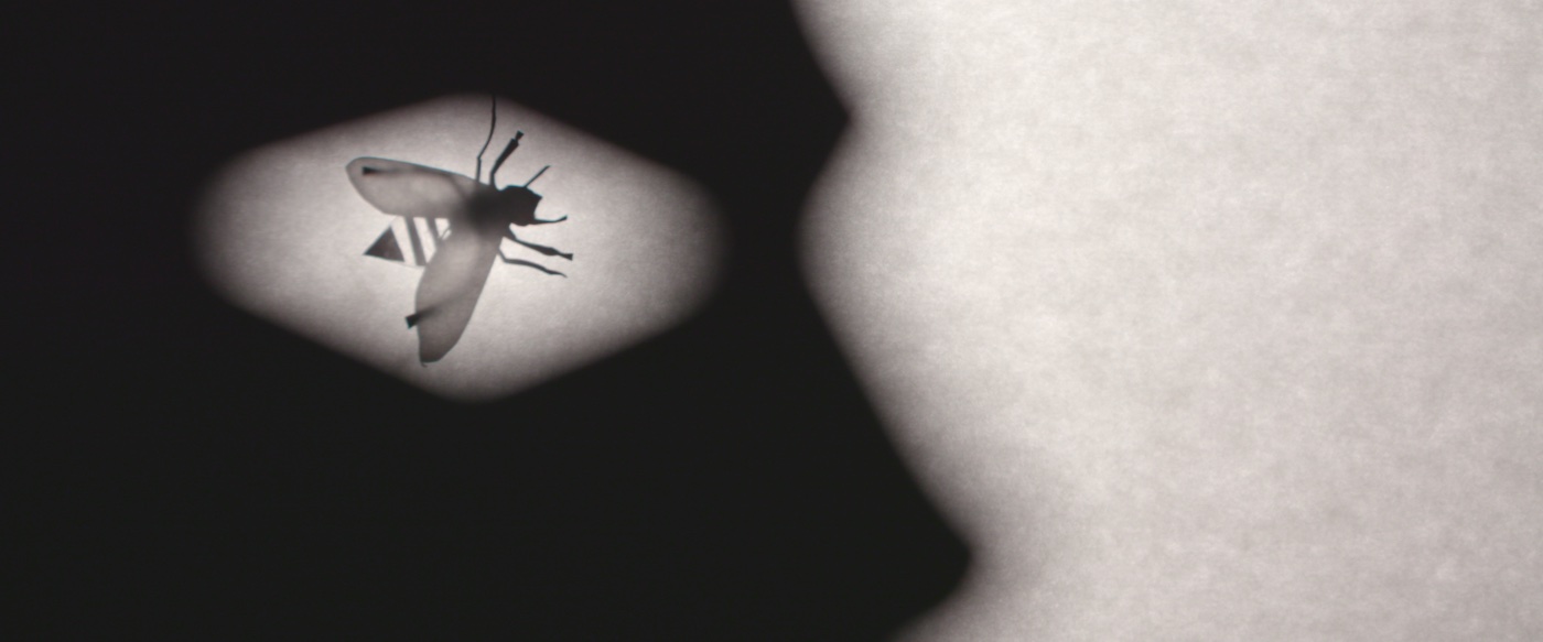
Method Studios also handled the various scenes with bees – a major departure from the original, which required actor Tony Todd to perform with thousands of real bees. As McQuaide continues: “To make the bees punch through enough to read clearly, we had to cheat them yellow. But we had the opportunity to do some surrealistic stuff. During the bathroom massacre, which is mostly implied, the camera focuses on a compact lying on the floor, and a bee lands there, and we see an increasing separation in movement between the bee and its reflection, which was a kind of choreography that proves important to hint at what is going on. Coppola’s Dracula, with shots showing Vlad’s shadow moving independently from the Count himself, was the exact reference we worked from.”
VFX integration was further massaged during the DI when Colorist Leonnet availed herself of various mattes and layers for fine-tuning. “In most instances, VFX vendors worked LOG color space from CDL’s generated on-set by James, so that ensured Natasha would have all the dynamic range available to finesse things,” Guleserian explains. “As a result, we have a ton of VFX shots that nobody will ever realize even contain VFX. We color-graded during the pandemic, and since there was no way to send stills back and forth securely with P3 levels of projection, I had to rely heavily on Natasha. I didn’t see much of anything until near the end of post when I came in via a remote Zoom screening room for a few weeks. Nia was in New York watching remotely as well, so it was a very different way to finish.”
Guleserian’s other recent work, An American Pickle [ICG Magazine September 2020] and Happiest Season, came out in 2020, at the height of COVID. “They’re great projects,” he reflects. “But I’d like to think Candyman being held back for a full theatrical release was justifiable – it’s a movie that deserves to be seen with an audience. We pay a lot of respect to the original, both in terms of the aesthetic and storytelling. When you’re up for a movie in a genre you haven’t worked in, as I was, it’s often the expectation to be rejected on that basis. I was fortunate that didn’t happen, and since I’m always looking to do something new, this was a perfect fit.”
McQuaide adds that while the original touched on political issues, “this movie kind of blew the doors off regarding cultural relevance. Yes, its roots are as a genre horror; and in that regard, I admire how Nia kept it sophisticated and showed restraint in terms of gore. But I find what it has to say even more admirable. Although we shot before the summer of Black Lives Matter came to a head, Candyman captured the zeitgeist of that moment. That’s what I hope will stick with audiences because these issues are far from being resolved.”
Local 600 Crew List – Candyman
Director of Photography: John Guleserian
A-Camera Operator: Michael Fuchs, SOC
A-Camera 1st AC: Jason Bonner
A-Camera 2nd AC: Elaisa Vargas
B-Camera Operator: Scott Thiele
B-Camera 1st AC: Hunter Whalen
B-Camera 2nd AC: Ron Ruanphae
Loader: Darren Sanders
Utility: Litong Zhen
DIT: James Notari
Still Photographer: Parrish Lewis
Unit Publicist: Ernie Malik
