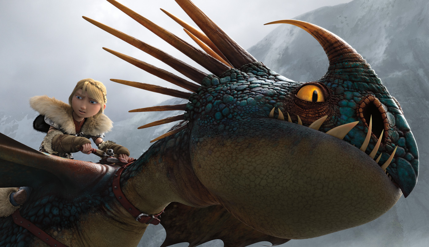
Roger Deakins, ASC, BSC, and DreamWorks Animation tame epic new lands for How To Train Your Dragon 2.
Almost six years ago, DreamWorks Animation directors Dean DeBlois and Chris Sanders, famous for having created what is now one of the last great hand-drawn animated features, Disney’s Lilo & Stitch, were tasked with reimagining Cressida Cowell’s best-selling children’s book, How To Train Your Dragon, for the big screen. They had only 14 months until release – a blink of the eye in animation time.
DeBlois, a layout veteran, wondered why lighting decisions were being made months after camera lock. “It seemed strange that we’d lock compositions and camera moves without knowing where the shadows would fall,” he relates during a break from final mixing at Skywalker Sound for his solo directorial effort, How To Train Your Dragon 2.
“Because I’m a huge fan of cinematography,” he adds, “I had envisioned Roger Deakins – who worked on the first act of Wall-E for Pixar – coming in for a series of lectures with our camera and lighting departments. To our surprise, Roger asked if he could join the production team for the remainder of the show.”
The rest, as any DWA animator will tell you, is history: one so remarkable and unique it has changed the way that studio makes movies. The digitally created How To Train Your Dragon (which went on to win 19 awards and 34 nominations) featured many Deakins trademarks: single-source lighting (often by fire/torchlight), characters falling off into darkness, a more muted color palette, and strongly composed frames that could stand alone as still images.
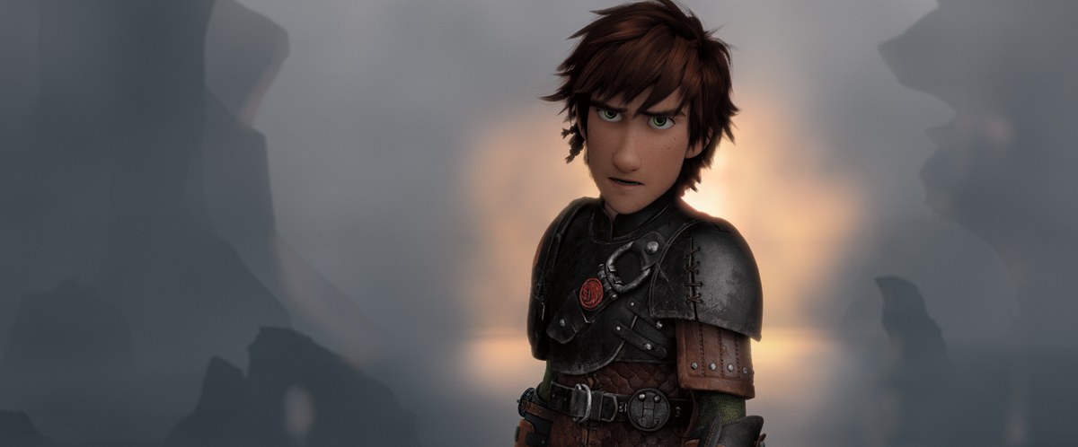
The experience among the main creative partners – Deakins, DeBlois, Head of Layout Gil Zimmerman, and Production Designer Pierre Olivier Vincent (aka “P.O.V.”) – was so fruitful, they reteamed for the sequel, which propels the film’s main character, the Viking Hiccup (once again voiced by Jay Baruchel) into wild new discoveries.
We talked to this creative brain trust, along with VFX Supervisor David Walvoord, to hear how two seemingly disparate approaches to filmmaking merged yet again for an even more epic action adventure, set in the ice-laden fjords at the top of the world.
Far From Home
ICG: This is a much bigger visual canvas than the first movie, as Hiccup and [the Night Fury dragon] Toothless travel far from their village. Weather – ice, snow, clouds, wind, and sea – all play a dominant role. How did your preparation reflect that?
DeBlois: Years ago I did a music video for an Icelandic band and fell in love with the light at the northern latitudes. During that job, I learned about the Svalbard Islands, which are located in the Arctic Ocean, halfway between Norway and the North Pole. Coming up with ideas for the look of Dragon 2, I pitched the characters traveling into this deep Arctic climate. As part of a research trip, Roger, POV and myself spent six days on a snowmobile safari over Svalbard’s glaciers and frozen fjords. The hues of light were incredible – magenta, pinks, slate. A lot of what we saw ended up on the screen.
Deakins: We stayed in a ship that’s been turned into a hotel, as it’s frozen into the ice during the winter. We went all over Svalbard, and the landscapes are quite amazing. The still photos we brought back served as key reference material.
DeBlois: Basically our process [in preproduction] was to put up this vast library of images Roger has, along with POV’s paintings, on corkboards in a room. We would assemble a color script for the film, and each sequence would get its own look.
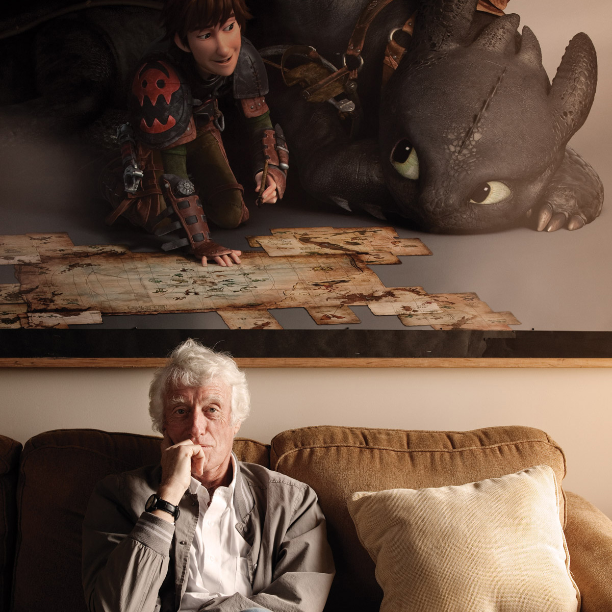
Deakins: POV is a kind of genius with translating those ideas. We could see the entire look, feel and color of the film in that room. Because animators work out of sequence, and it can be months between scenes – [laughs] – years, I should say, this kind of game plan certainly kept me from getting lost. I would go off and do my [live-action] work and check back in – either fully connected from the road, or going into the studio.
Zimmerman: We called it our “creative brain trust.” The meetings were key to helping [layout] create a “rough pass” of every scene in previs. Not only lighting and camera, but also animation, VFX representation and crowd systems. They provided a creative and practical guide for the downstream departments, to help them figure out what things would cost. While Dragon 2 had a healthy budget by animation standards, it was not unlimited and nowhere near what it would cost in a live-action treatment.
P.O.V: It was also the best way to convince the company of our concept. Roger is so specific in how an image can draw emotion, and that was new for us. He’s quite stylized in his approach, which is a great fit for us in animation.
When Worlds Collide
ICG: A good fit perhaps, but there are so many stunning scenes that break away from animation’s use of saturated color and fully lit frames. Toothless falling into the sea, the introduction of Valka (Hiccup’s mother) in her dragon lair, and Stoic and Valka’s romantic reunion, to name just a few. Were your approaches ever at odds?
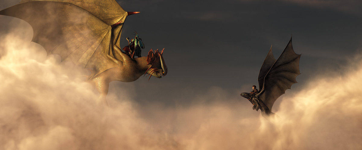
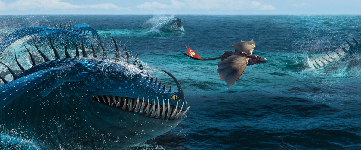
Deakins: [Laughs.] We are making movies for very different audiences. But I think the suppression of color, and there is quite a bit of it in Dragon 2, is a reflection of what we saw in Svalbard and the story Dean wanted to tell. The glaciers there have this amazingly luminous turquoise with streaks of pink, and you see that when Hiccup and Toothless are flying through the clouds, and over the sea. The scene of Toothless falling into the water was probably the closest to the actual reference material of anything in the movie.
DeBlois: It’s actually based on a series of photographs Roger took on our first night in Svalbard, at the only human settlement on the islands. We were on a beach, close to midnight, and the sun was low in the sky peeking through the clouds with yellow bands refracting off the ice. Above the clouds, we imagined these long, soft shadows, and then when Toothless punctures through [the clouds, falling into the water], it’s this cooler band against the icebergs and sea. It was a nice visual way to express Toothless and Hiccup, secure in each other’s company, and then a different, more melancholy mood, once they are wrenched apart.
Walvoord: Animators see like painters, with the human eye; so every sky and shadow is fully exposed, expanded, like the way the brain does in real life. Roger sees the world through a camera, which has a set range of exposures. He’s not afraid to put a character in the foreground in complete shadow, which was so different and fun for me. Of course, there are similarities: we’re both very graphic, dividing the frame up into light values that designate foreground, mid-ground and background to create depth. But Dragon 2 goes so much further than we would have dared without Roger’s influence.
Deakins: My input was often about taking away lights, asking them, How much do you need to see to tell a story? I remember having the exact same conversations back on Wall-E, and I would ask: “Why add another light source? Keep it simple.” Because we had built up trust over the first film, it was easier for them to go further – darker, less saturation, more depth of field, with out-of-focus backgrounds not often done in animation. The scene where Hiccup comes to Valka’s cave shows how much they embraced this challenge. There’s this wonderful green twilight in the ice and then the fire comes out of the dragon’s mouth – scattered source lights in a really dark interior.
POV: This moment in the ice cave is a sequence that would frighten everybody in animation. Producers are scared to go dark when you are serving a general audience. At the same time, that was the correct mood for those characters, and Roger was so helpful and courageous. He told us, “No, you need to go there. It’s so important for the emotions of the scene.” For me it’s a pivotal moment in the film, and for the animation industry. We’re not usually allowed to go there, and we did.
Walvoord: Color is another area where animation and live-action aesthetics diverge. Saturation can be a fallback for animators, in terms of character, separation, and depth in the frame. Roger is known for desaturation, but he does use intense color; it’s just one at a time, like the fire in Skyfall. We picked up on that in Dragon 2, like when Toothless falls in water and we went super blue. Or the Viking funeral sequence, which is really monochromatic with just these little orange accents of flaming arrows.
POV: We have a lot of flexibility building our world that I think amused Roger, who must deal with very practical issues in live action. Scale is one area, for sure. We can dramatically transform elements, and Roger would look at a scene, and say, “My God. Those trees are gigantic!” [Laughs.] Of course, our characters are stylized, and the percentage of stylization can often be found within the environment.
Taming the Virtual Camera
ICG: Let’s talk about camera movement, blocking and composition. Animators can do anything with a CG camera, but should they?
Zimmerman: I remember conversations on the first Dragon about Roger wanting to “dirty up the camera” on his own dolly shots. He noted how few moving shots are perfect in live action – bobbles on the tracks, the operator moving his hand – it’s rare to ever have a pure lock-off in live action, and our audiences have seen more live-action films than animated, even the kids, so they are accustomed to these imperfections. For me, tour de force CG moves can feel computerized and pull you out. So we approached movement as Roger would, allowing the camera to “disappear” into the storytelling.
DeBlois: We’ve seen examples in other CG animated and motion-capture films where the camera does anything it wants. One restriction we set for ourselves is that each shot needs to look like there is an operator behind the camera. Steven Spielberg commented on that in the first Dragon and again this time. He said every shot is something I could go out and create with a live-action crew. We’re very proud of that.
Zimmerman: Continuing on the virtual freedom of CG, you may have an over-the-shoulder to a close-up, or a progressive push-in, as we do in the scene where Stoick reunites with Valka – very romantic and tender leading to their kiss. Roger challenged us to think in a live-action sensibility, where a DP will go from a 32-millimeter over-the-shoulder and punch into a close-up with a 50 millimeter. The depth of field and compression of space – limiting what happens in the background – happens naturally, rather than just pushing in with a wider lens, which is a typical approach in CG animation.
Deakins: That scene with Valka and Stoick was one of the hardest to find a look for. We didn’t want to do it all firelight, and we did have some daylight that was filtering in through the icy exterior.
DeBlois: We just didn’t have a clear sense going in. And the first attempt had this artificial light feel, like Valka had a KinoFlo bank in front of her! We talked about how to give it atmosphere, to make it feel dreamy and romantic, which is ultimately what that scene is all about. Roger had this idea to fill it in with a bit of smoke, and bring in these long, soft diagonal rays that warm it up, while still separating the characters from the background. The results were fantastic. It’s like a Renaissance master painting that is delicately rendered yet still very real.
Of Myth and Magic
ICG: What do you take from this unique collaboration, and where do you go from here?
Walvoord: Certain scenes we simply would not have even tried to light without Roger’s influence. One of my favorites, in the old blacksmith shop [now the dragon armory], is a great example. Conceptually it was very hard – dark with these thin strips of light that lit very busy, very fast, and you didn’t know where to look. Finding a way to control where the light and shadows were that supported the acting and composition was a challenge. Roger’s approach is about simplicity, and that left such a mark. In fact, over and over again we’d show him scenes, and he’d say: “That’s a lovely picture. Now turn all the lights off.” We’d start to turn them back on one by one, and if the light didn’t need to be there, we left it off. I tell people I got paid to apprentice with Roger Deakins and what could be cooler than that! This might embarrass him for me to say, but he has forever changed my approach to filmmaking.
Zimmerman: I felt like this film and the first Dragon were natural pairings for me because Roger’s aesthetic is the same as mine. [Laughs.] Maybe that’s because I’ve learned so much from watching all his movies. Roger’s ability to invert our more traditional approach to storytelling has changed our culture. Like in the Viking funeral scene, which we boarded in a very rudimentary way, and then changed to a series of shots, à la Roger, that are more oblique. We see them lighting the bows and arrows, and then the reveal of the ship moving away from shore, with someone on it, as they shoot these pinpricks [the flaming arrows] into the darkness. Or the final battle scene, which is nearly black and white, and all the complex staging of characters to make sure the action is clear and precise. I know this will embarrass Roger, but the scariest moment of my career was when I had to show him my first scene [from How To Train Your Dragon]. It’s like stepping up to bat with Babe Ruth watching.
DeBlois: My feeling is that there’s been a vast improvement in digital tools since the first Dragon – PrEmo on the animation front and Torch [part of DreamWorks’ proprietary Apollo software] on the lighting side. Both allow the artist to work iteratively in real time, and not that differently from how Roger Deakins would work on a physical set or location. CG artists can set lights, and, then, as Roger always teaches us, begin to subtract lights to get closer to that single-source approach, which typically makes the concept that much stronger. I remember when we were close to completing the first Dragon, and James Cameron came to the studio to talk about Avatar. We showed him the “forbidden friendship” scene, where Hiccup first touches Toothless, and their first flight. He said we were approaching the same line from different mediums. Certainly both these experiences with Roger have brought us much closer to his world. And I’d like to think that we’ve given something back, as well.
POV: We live by so many rules in animation. And having Roger, with all his experience, urging us to break those rules was liberating. Animators always worry about continuity, but he introduced us to a different perception of continuity – in the color and emotional quality of the image. He would say, “It doesn’t matter how you get there. Just try it.” For us, that’s quite audacious. And I don’t think we would put those images on the screen without the confidence he provided. It transformed our world.
Deakins: Obviously there’s a blend going on these days. Live-action movies are far more animated than people realize. Life of Pi, for example. And we’re on post on my last film, Unbroken, where there is a fair bit of complex CG work, which is akin to what they’re doing at DreamWorks. But live action is expected to be highly naturalistic, and if you go that far with an animated character; frankly, it can look weird – slightly unnerving. In fact, we talked about that with both Dragon films, and we didn’t want to go so naturalistic that we’d lose the playfulness of these animated characters. Everyone at DreamWorks is so brilliant. And they probably don’t need me at this point. Although I hope I’m still involved in the third film. [Laughs.] I really enjoy it.
By David Geffner / Photos courtesy of Dreamworks Animation

