Sporting a distinctive visual aesthetic established by Guild Director of Photography Jay Hunter, NBC’s American Auto roars off in high gear for Season 2.
by Kevin Martin / Photos by Greg Gayne/NBC
Showrunner /EP/Writer Justin Spitzer developed the initial concept for American Auto nearly a decade ago, after concluding a long stretch writing and producing The Office. While researching the auto industry, Spitzer secured tours of the Ford Motor Company’s corporate and design/production facilities in Michigan. Failing to generate interest in the upper-management-focused project, he turned his attention to another office comedy, the hilarious and successful Superstore. During this time, Spitzer formed a team of behind-the-scenes creatives who would support his vision for the workplace-based series; many of them would later extend their collaboration with him when he signed with Universal Television to revive the American Auto concept, which made its debut on NBC in 2021.
After the series was greenlit, Spitzer approached his Superstore Director of Photography Jay Hunter, whose résumé also includes sitcoms, unscripted, and such indie features as Paper Heart, Life After Beth, and Joss Whedon’s Much Ado About Nothing. Hunter says he was supposed to shoot the pilot, “but when COVID happened, all the schedules got out of whack, and so by the time it went, I was back from hiatus and shooting Superstore. When I came on for the new series, both Justin and I agreed it was a good idea to elaborate further on what [Guild Director of Photography] Benjamin Kasulke had done with the pilot.”
Part of that process involved developing a look that was differentiated from their previous collaboration. “Essentially we customized a new visual language for American Auto,” Hunter continues. “While brainstorming, I thought of Veep, which is a favorite of mine both for the writing and the comedic rhythms. I thought this series might be cut from a similar visual cloth. Justin was thinking along the lines of Succession, which I also love but is a very different style. Those shows and looks were our starting point.”
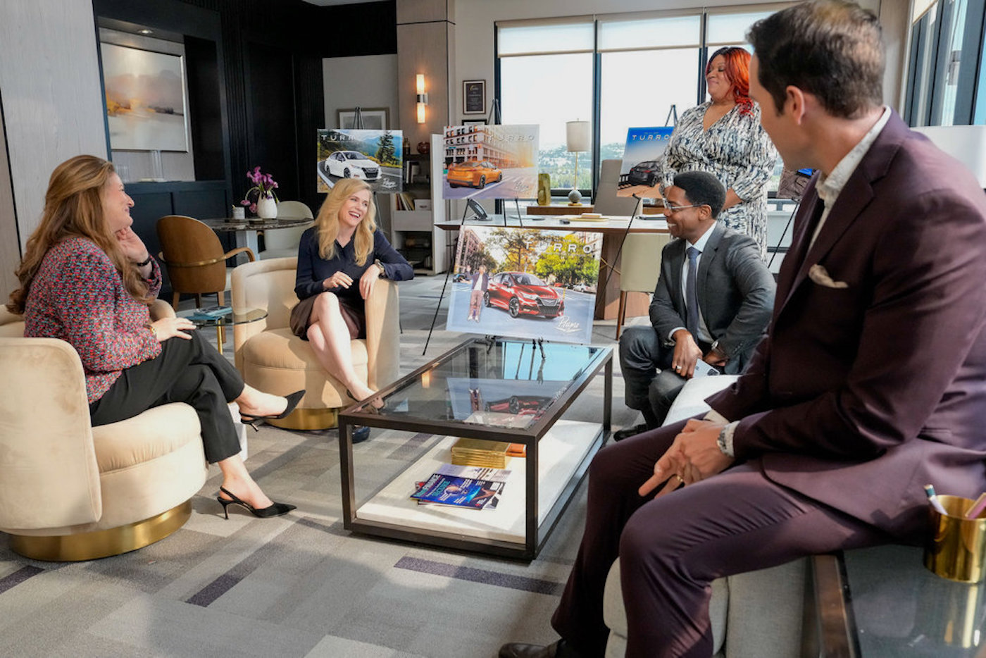
While the pilot had been shot at an unused auto plant in City of Industry, in eastern L.A. County, the series would, for the most part, lens on new sets built at NBCUniversal soundstages. “The flexibility to control lighting and pull walls if necessary was going to be a big net gain of being on stage,” Hunter continues. “We didn’t build it as a slavish recreation of the pilot location, feeling that the way to go for a series – which could have a potentially long run – would utilize the general look but differ significantly in layout and style.”
Another Superstore creative, Elliot LaPlante, also came aboard. Initially working as art director under Season 1 Production Designer Michael Gallenberg, she has since taken over the role of production designer for Season 2. LaPlante says, “It’s immensely valuable that this creative team has worked together for some years now. We’re a close-knit group. We have a shorthand, we trust each other, and we know how Jay likes to shoot. By this point, we can usually anticipate issues before they arise, and chase down solutions that best serve the story.” And since Spitzer most often worked from the writer’s room, LaPlante, Hunter (who also directed one episode in Season 2), and either of the 1st AD’s – Ross Novie (who, like Hunter, also directed a Season 2 installment) and Mike Helfand – formed an on-set triumvirate for Producer Meg Schave and the incoming directors.
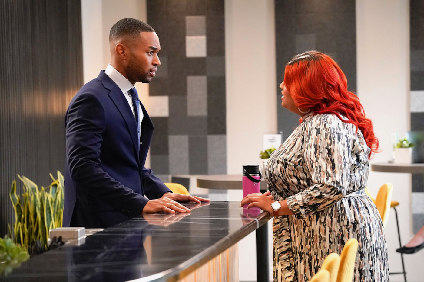
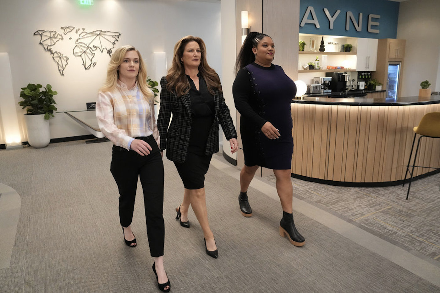
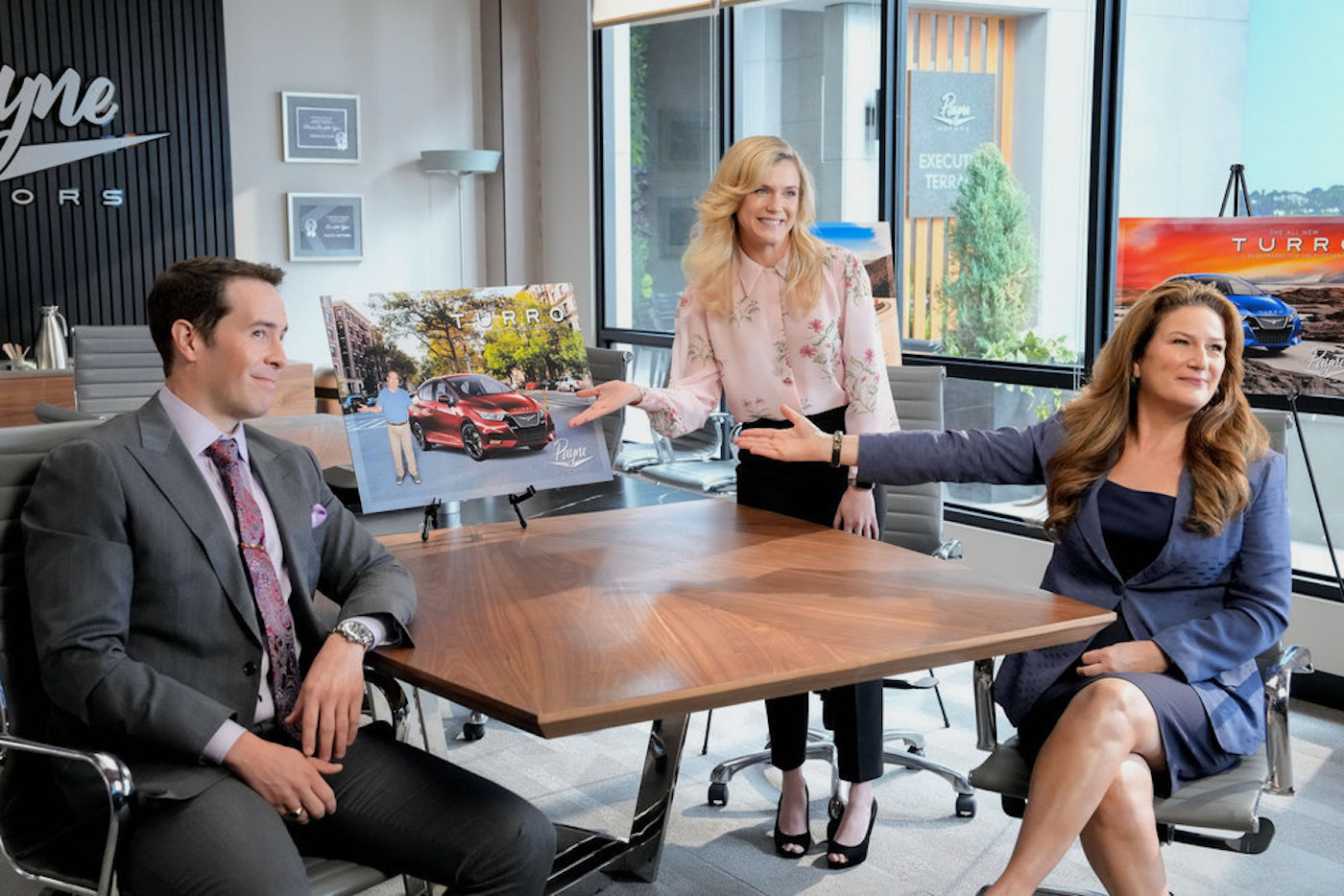
One key objective for the set builds was “to deliver a sense of scope and spectacle that is often hard to achieve on stage,” LaPlante continues. “What struck me most in looking at the headquarters of various high-end auto companies was the openness of the space and the cohesive visual language throughout. When creating Payne Motors, we looked to do the same – focusing on strong branding, repeated visual elements, high-end finishes, and lots of glass. The set itself is constructed on a track, so we can capture the sense of scale and movement in those banter-ific walk-and-talks. Long throws punctuated by glass walls inside the offices, giant floor-to-ceiling windows on the outside with daylight illumination, and our 180-degree-wide curved backing – there is visual interest no matter which direction the camera faces. Also, no hallway on our set ends in a flat wall or straight line. I wanted the viewers to have the sense that everything flowed seamlessly, so we used a lot of curved walls to draw the eye forward.”
To enhance the high-end, corporate feel, custom wood paneling was incorporated. “There’s a distinctive wood-slat finish throughout the set that I’m probably way too obsessed with, and I owe a great deal of thanks to our amazing construction team that hand-milled, stained, and applied each piece,” La Plante adds. “We did it in a white-oak style, and it’s been a great lesson in the functionality of design.” The slate look ingeniously contributed to a shortcut for shooting. “There are televisions in nearly every room,” she continues, “and in the case of our lead character’s office, it is hidden behind those sliding white oak slat doors, so we don’t have to always see media being displayed or a blank screen. The added bonus was that these doors also work as camera ports, so we can quickly open up the offices and shoot from that angle without having to pull walls.”
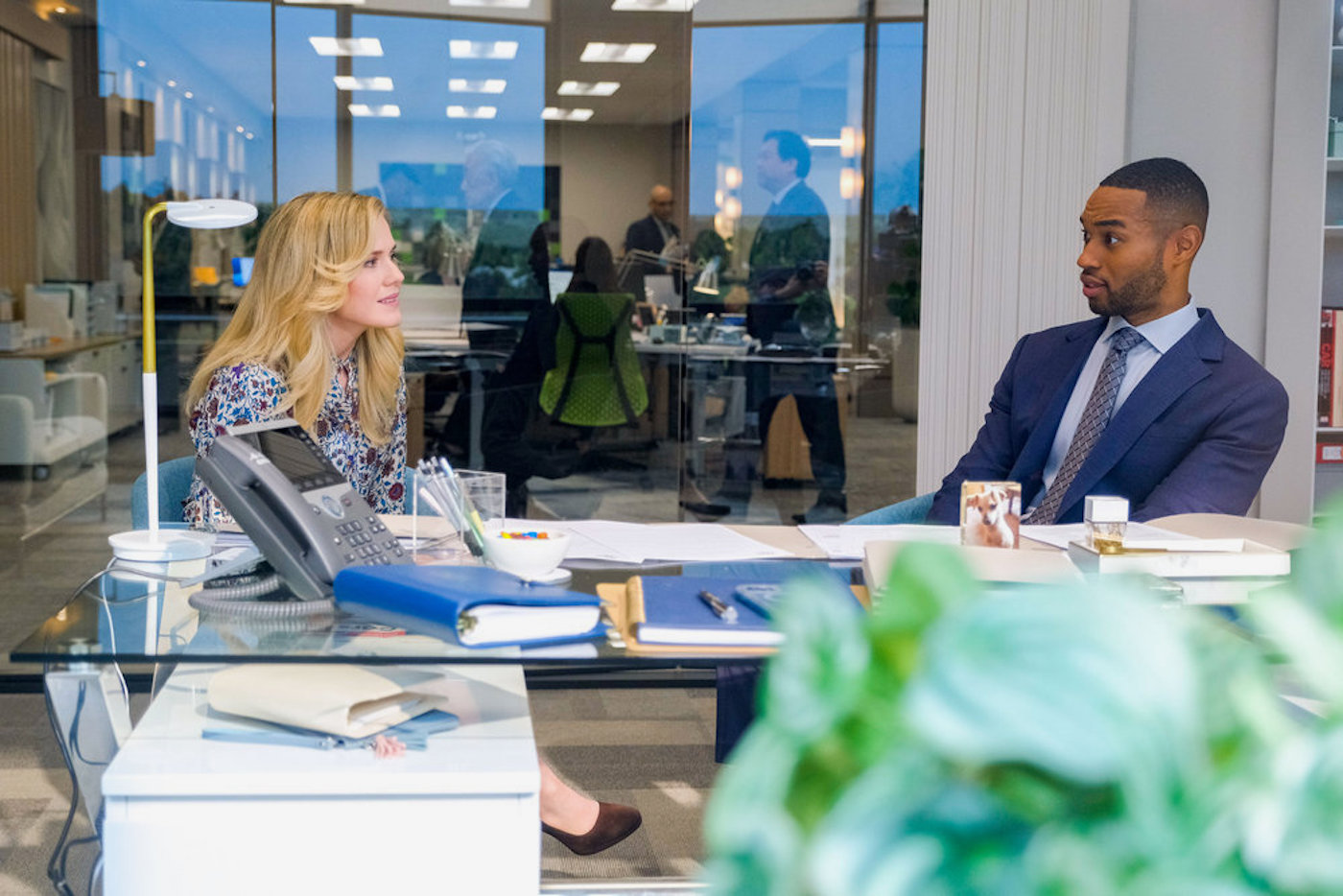
For Hunter, a typical failing in comedy is how sets don’t often come off as distinct locations. “Many comedies don’t invest time and effort when it comes to having subtleties in lighting or set construction,” he describes. “I create most of our lighting on the main set to reflect that the illumination is coming from outside exterior sources. I’ll set the color temperature at 4300 Kelvin, so that gives us a cooler light. We created both a soft ambient source as well as a hard sun source, providing visual variety. Other series might use half what we do for that aspect, plus they’ll balance the daylight sources to match the interiors. Instead, I like to introduce ‘flaws’ or inconsistencies of the type you always wind up getting when shooting in real locations.”
Key to making the big-window look work was the scenery outside the glass, manufactured by J.C. Backings. “We had to do a lot of work to determine where we’d have the horizon line,” recalls LaPlante. “We wanted to always represent a huge expanse of sky, no matter what direction you look. We also had to do blur tests to determine just how much to unsharpen the image so that it looks out of focus to an appropriate degree.”
To sell these rooms with a view, Hunter continued to treat the stage like a real location. “In reality, the sky would be ten stops over on a real location and the landscape eight,” he observes. “We have a lot of 20K hard lights outside the windows. I figure out the time of day, then put the 20K’s at an appropriate angle. It can look a little ugly if we’re emulating one p.m., but embracing that defect is a great way to start the lighting – although, I will then try to smooth around the edges, so to speak, of this bump we’ve put in the rug. If we spend the next few years shooting hundreds of scenes in these offices, it would be very boring to stick with a static look throughout. The grip/electrical crew [led by Key Grip Travis Belgard and Chief Lighting Technician Justin Duvall] sometimes has it tougher as a result. But approaching each scene on its own contributes to the feel of the show.”
The pilot was shot on ARRI AMIRAS, and although Hunter inherited that decision, he says his team learned to love it. “It’s the same guts-wise as the ALEXA Mini,” he explains. “But it feels balanced well for handheld, and we often work off-the-shoulder. We shoot 3.2K resolution, which gets down-resed to 1920-by-1080 for delivery, so it isn’t like we need the latest and greatest camera. Spending money on that for the network is, for me, like spinning your wheels in the wrong direction. Also, by using a less expensive camera, I have money to get more lenses we might not otherwise afford. We always carry a remote head with us on the truck in case of a special shot.”
Other gear includes Fisher, Creeper Butt and Rickshaw Dollies – the latter being especially useful for walk-and-talks since Spitzer dislikes smooth dolly moves. “The Cartoni Airfloater is another such tool,” notes A-Camera Operator Adam Tash. “Like a volleyball, but in a fancier package, it lets us stay on the Fisher while still achieving that handheld look – and without breaking our backs.” Production prepped at Panavision Woodland Hills. A-camera 1st AC Jason Zakrzewski, who has worked with Hunter for nearly a decade, notes that workhorse lenses for the series include three Angénieux Optimo zooms: 15-40 mm, 28-76 mm, and 45-120 mm. “They’re compact, lightweight and let him achieve a wide variety of focal lengths without losing time changing lenses.”
American Auto also keeps a RED Komodo on hand for when “The Beast” is employed. “That’s a very rare piece of glass: the ISCO 140- to 420-millimeter zoom, created by Clairmont,” Hunter smiles. “Three of the four made are still around, and I got one of them. ‘The Beast’ is super-fast and razor-sharp, but unwieldy and gargantuan. Your typical handheld comedy show wouldn’t carry this in their arsenal, but since we aren’t spending much on the camera platform, this kind of useful oddity does become an option, and in turn that helps refine and shape our look with its unusual qualities.”
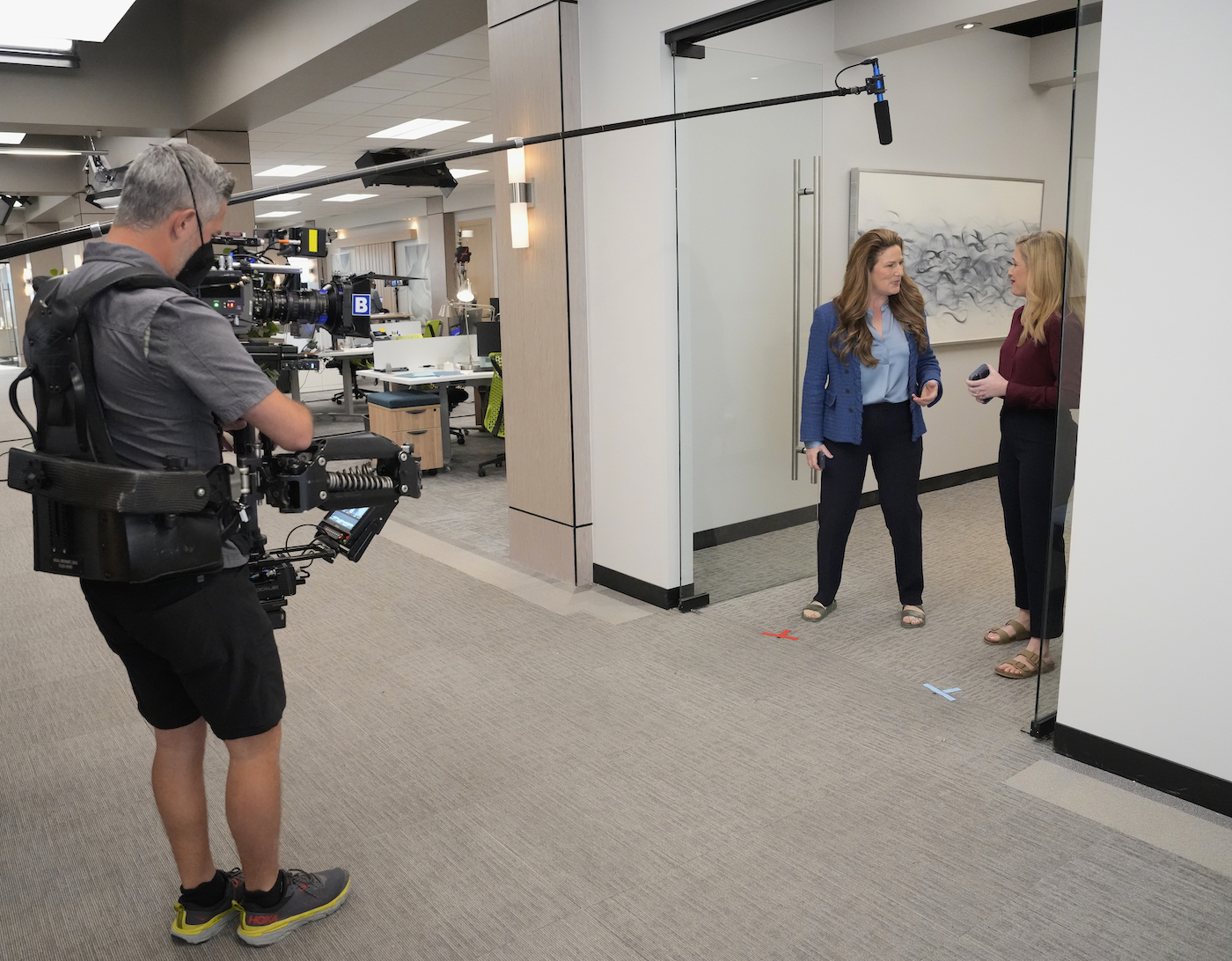
Hunter says his typical preference is to keep postproduction in post. “Going lean-and-mean and not doing color work [on set] is necessary because our sets move very fast,” he shares. “I pretend I’m working off a particular film stock. I might check the LUT and realize highlights are looking a little burned out, but that doesn’t make it a panic situation where I have to ask a grip to set a net or a flag. Since I’m shooting Log-C, I can pull those highlights back later and consequently won’t stress out about it.”
DI Colorist Jim Garrow collaborated with Hunter to lock in a distinctive LUT that helped the show create a unique look among comedy series. Starting with a film look found in the ARRI library gave the pair inspiration for their exploration. “This happened when COVID first hit,” Garrow relates, “so Jay wasn’t able to come in. But he had a calibrated iPad, so we could bounce ideas back and forth. In general, the look is low-contrast and more unsaturated than other network comedies, with blacks going toward blue. If Jay adds warm light anywhere, it is while keeping in mind how that will play with the established look. Season 2 opens with a show that features a distant fire, so that’s an example of how we played with departures from the established look for contrast. Jay also changed the exposure on the windows, so they read a little hotter in the second season. But it is subtle; it doesn’t read any differently on a vectorscope.”
Spitzer and Hunter collaborated on a style guide for the show’s look as an aid to new directors. “I’m usually shooting when Justin has a tone meeting with the director, so this tool lets them get specific with him about approaches long before going on set,” Hunter describes. “We do have a lot of rules – some things we never do and other things are done only sparingly. For example, it is very rare for us to use wide lenses – 35 millimeters is pretty extreme for us, with wides shot on a 50 millimeter. Because we are thought of as a handheld show, there might be a first instinct for a new director to think ‘mockumentary,’ wanting to do a lot of zooms and whip-panning, but that isn’t our thing. We have a more refined version of the vérité look; the camera is never active in a self-conscious kind of way.”
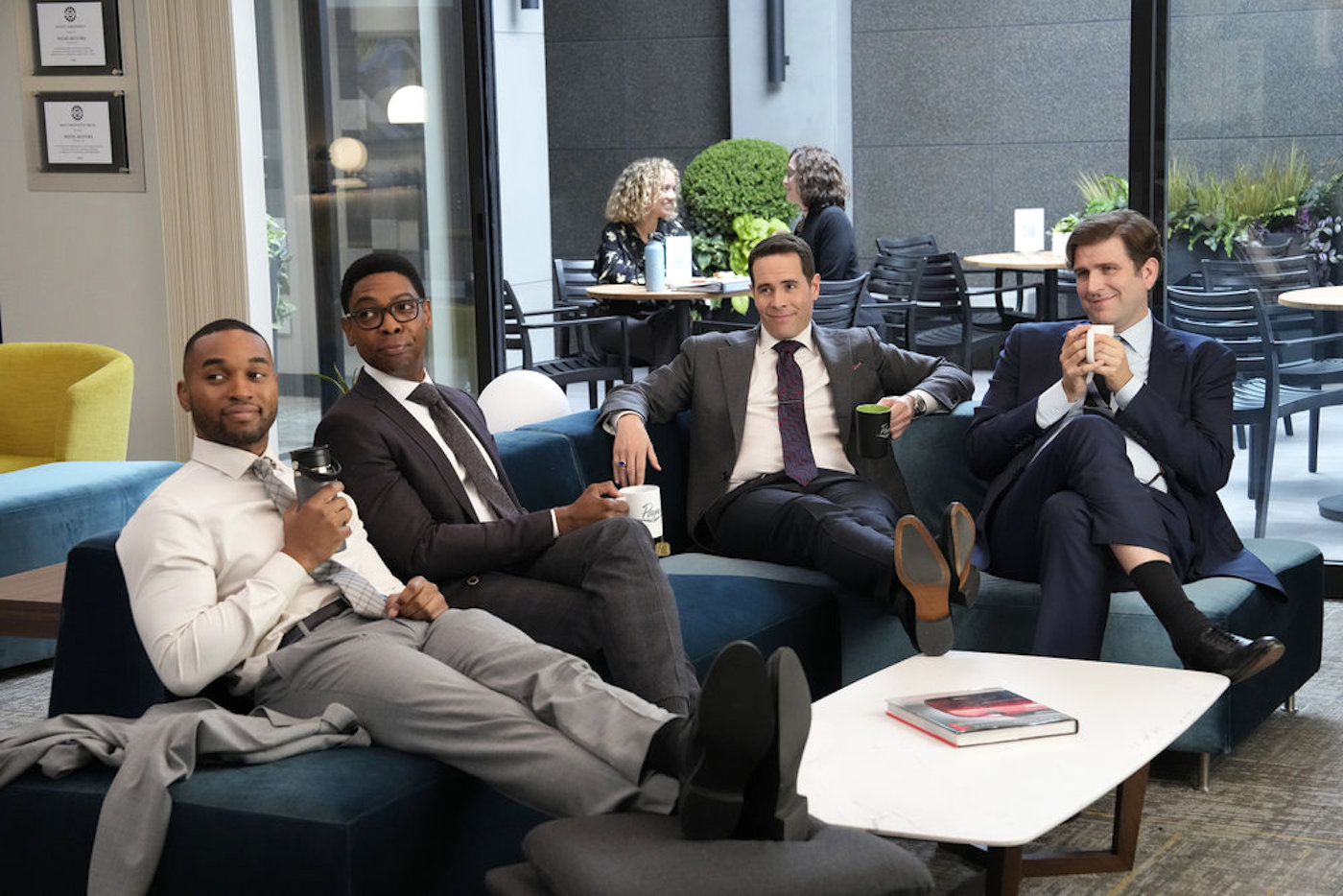
Since Spitzer prefers that production cross-shoot, Hunter always fields three cameras. “That lets us get both sides of a scene plus a wider view simultaneously,” he states. “But the biggest challenge comes from the cross-shooting, as it’s always a puzzle to solve, making the actors look good from three angles simultaneously. Justin wants realism and believability above all else, which can sometimes make your inner cinematographer voice complain that that goes against making things pretty and photographically perfect. But in thinking it through, you realize the truth in his take and how it keeps all the elements in service to the story.”
The cross-shooting does offer benefits for editorial, especially when the actors go off on a “fun run” – a take allowing them to engage in improv that always keeps Tash and fellow Season 2 camera operators Danny Whiteneck and Jacob Pinger on their toes. “Those takes when the performers ad-lib sometimes produce real gold,” states Tash, “and that is a part of the show’s charm. Having coverage for those moments helps us preserve them. And Justin likes the frames on each cross to match, which is different from other series. So, we take care to achieve matching compositions in each direction with the same focal lengths.
Hunter generally chooses to utilize three-quarter backlighting to cross-key the principals. “Everybody’s side- and edge-lit; that’s our look and we try to adhere to it whether on stage or during the occasional location shoot,” he explains. The latter situation is where cross-shooting poses greater difficulties. “Depending on the location, there’s a chance we may have to limit the shoot to directional work,” he adds. “Pre-rigging helps, but if we can’t put a lighting unit up in the ceiling, it can impact our ability to shoot multiple cameras. And while that’s fine from my perspective, for the showrunner, it can be a major bummer.”
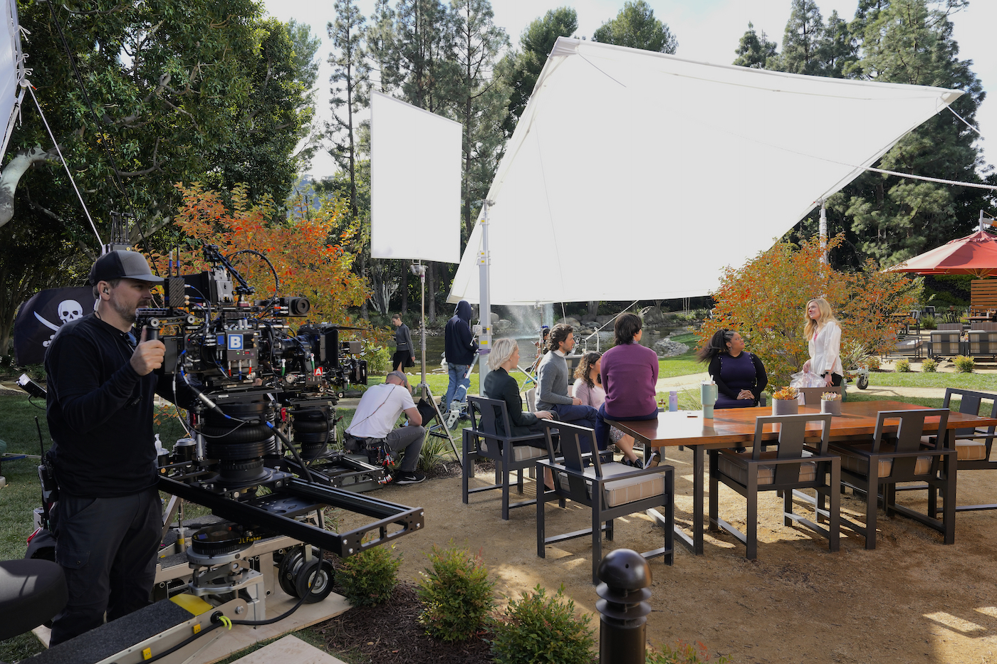
Whether on stage or location, there is a concerted effort to keep the stop at about F/4, which gives Zakrzewski and his fellow AC’s a good shot at managing focus. “There are times when we’re only a half-stop from wide-open, which can be another big challenge for the three of us,” Zakrzewski acknowledges. “I’ve been an AC for 25 years and pulled focus about half that time. Even with all the advances, I still run a tape to measure and confirm distances while at the monitor with the Light Ranger, plus there’s a Preston Hand Unit 4.”
All of these tools come into play to facilitate the dance between the operator and the focus puller. “Jay lets the operators know what kinds of shot he expects from each, but the matter of how each shooter achieves that is their own business to work out,” Zakrzewski continues. “When we have a shot of six actors at a table, Adam [Tash] is probably following dialog as he jumps back and forth between actors. So, rehearsal for us is mainly his communicating to me where he is going to go and what he is going to do, and then we just knock it out.”
Another aspect of American Auto cited in the style guide relates to “foregrounding,” which derives from Spitzer’s love of shooting through and around objects and figures. “We’ll take platters of props and set dressing, arranging them on apple boxes in front of the lens,” Hunter recounts. “He also likes our coverage to be done over someone’s shoulder, feeling that a dirty frame reflects the feeling that represents the viewpoint of a passive observer.” Tash embraces the approach. “My perspective is that the foregrounding is part of what makes the show unique compositionally. When we break up the frame, it’s not done in a voyeuristic way; it isn’t supposed to be like the camera is hiding in a bush.”
Distancing itself from the mockumentary genre pioneered by The Office, the show usually eschews using zoom-ins. “They get seriously overused in comedies,” Hunter observes. “Following a punchline with a zoom-in to someone’s reaction to accentuate the moment is what Justin and I call a ‘rimshot zoom.’ Not only does it feel like a very played-out trope, but it also makes the camera-observer more of a participant in a way we don’t like, commenting on the action almost like a laugh track does.” Traditional cinematic language also undergoes something of a translation in the series. “Our version of an extreme closeup is pretty wide, from the belly button on up,” Hunter adds. “We hold off on head-and-shoulders close-ups, saving them for special moments. Justin and I both think the humor comes out best in three-shots and four-shots.”
For the digital intermediate, Jim Garrow relied on Blackmagic Design’s Resolve, utilizing online output mode to create nodes for each episode. “I time the show to look relatively normal on the first pass, then apply what is called my ‘final color-correction node,’ pasting that in on top at the tail of that pass,” he explains. “From there, I do a second and final pass on the whole episode. Given that we have a distinctive look, doing normal correction first and then applying the look is the most efficient way to go. We also have certain aspects that require separate treatment. Whenever we have monitor comps with ENG-type footage, we deliberately make it look more contrasty and ‘normal’ than the rest of the show, which makes this element pop.”
Hunter sees the philosophy behind the series as straightforward and effective. “On Justin’s shows, everybody knows it is about what we can do in helping deliver both story and character,” he states. “It’s not a showcase for demonstrating talent with a fancy camera move or some other showy aspect that detracts from the episode. And our entire team is good with that.”
He cites an episode in season one of American Auto’s ensemble unity from both the crew and cast. “The characters are shooting three commercials on the same set, so we were using multiple cameras to shoot the various cast, plus there were live feeds for what they shot showing on these monitors,” Hunter concludes. “So, we had seven cameras going nearly all day, and seeing our characters – instead of our crew – at Video Village as they reviewed all this imagery was crazy! It could melt people’s brains if you let it, but our team handled it all like the pros they are. I wouldn’t have wanted to try that with any other group of people.”
Local 600 Crew – American Auto – Season 2
Director of Photography: Jay Hunter
A-Camera Operator: Adam Tash
A-Camera 1st AC: Jason Kakrzewski
A-Camera 2nd AC: Blake Hooks
B-Camera Operator: Danny Whiteneck
B-Camera 1st AC: Brandon Margulies
B-Camera 2nd AC: Estefania Garcia
C-Camaera Operator: Jacob Pinger
C-Camera 1st AC: Ken Bender
C-Camera 2nd AC: Robyn Buchanan
Loader (Ep 201-209): Jajaira Corria
Loader (Ep. 210-211): Zac Prange
Loader (Ep 212-213): Liam White
Utility (Ep 201-202,208,210,213): Lauren Vanderwerken
Utility (Ep 203-207, 211-212): Kyle Kimbriel
Unit Still Photographers: Greg Gayne, Adam Rose, Trae Patton, Ron Batzdorff
