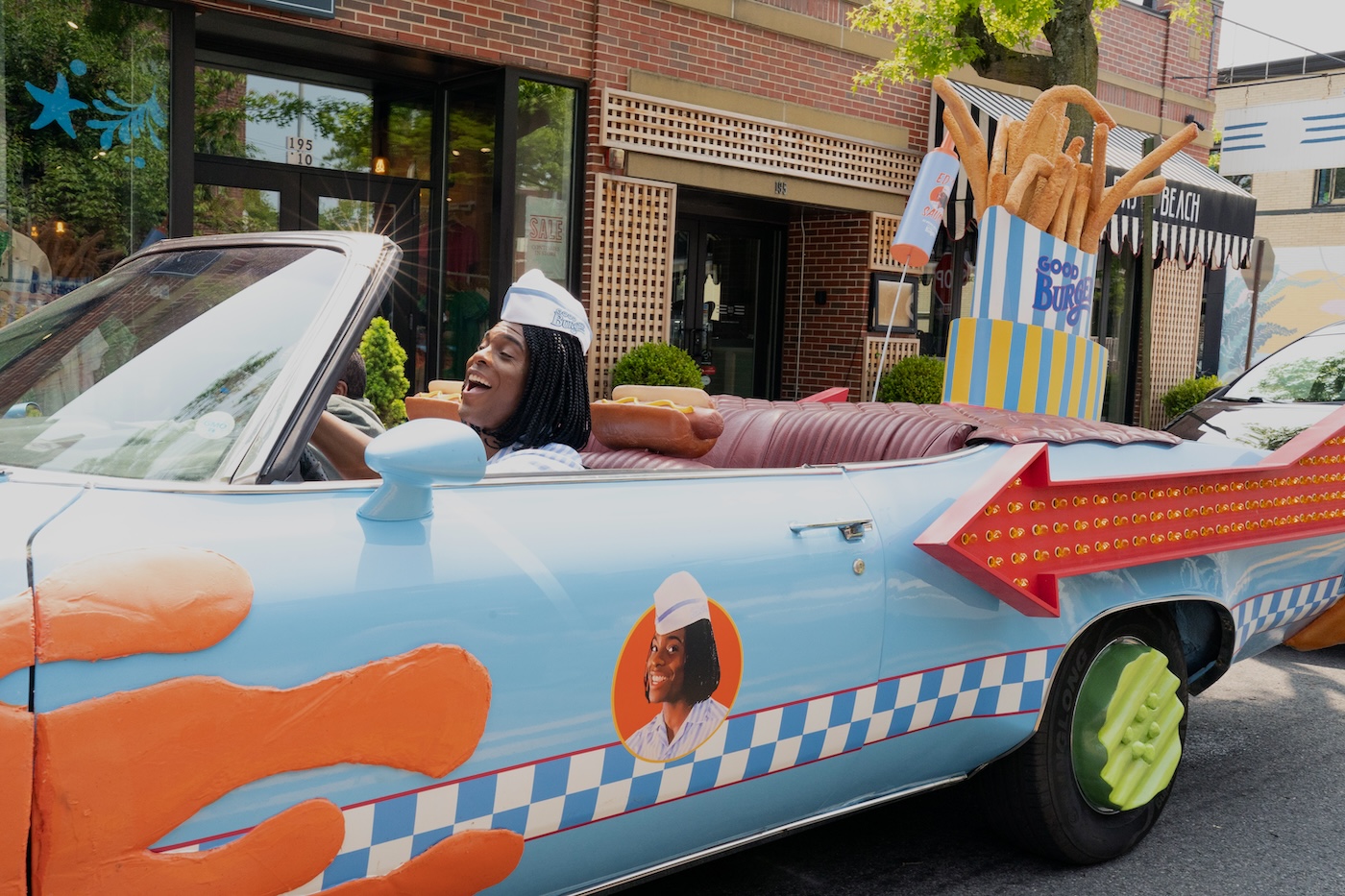
Director of Photography Jay Hunter, and his Guild camera team, shoot a “comedy with everything on it,” for a sequel to the whacky 1990’s feature, Good Burger
by Pauline Rogers / Photos by Vanessa Clifton/Nickelodeon/Paramount+
“I’ve never shot a sequel for a beloved film before, and we took that task very seriously,” relates Guild Director of Photography Jay Hunter about Good Burger 2. The film is a follow-up to the insanely wacky 1997 feature, based on a Nickelodeon comedy sketch about a high-school student working at a fast-food restaurant who uncovers an evil plot by a rival chain. “I was a little too old for the original Good Burger,” Hunter adds. “It premiered 25 years ago and was geared toward kids. But the film has a huge following of adults who grew up with it, and an army of young ones who have discovered it recently. On top of that, the original movie was directed by Brian Robbins, the current President and CEO of Paramount!”
Good Burger 2 was also written by the original film’s writers, Kevin Kopelow and Heath Seifert, and designed by the same production designer, Steven J. Jordan. And, picking up where they left off, are the same stars, Kenan Thompson as Dexter Reed, now a budding (and completely unsuccessful) entrepreneur, and Kel Mitchell as Ed, who, 25 years later, now owns Good Burger and introduces Dex to a pack of new (and odd) employees. Hunter says that when Phil Traill, a director he’s worked with on several TV projects, reached out with a chance to shoot the sequel, he jumped at the chance. “Then I read the script,” Hunter smiles, “and my first reaction was, ‘How in the hell are we going to shoot this with so little money and no time?’ The film was dense with gags, VFX, and technical difficulties that I instinctively knew we were not budgeted for, so it seemed [at first] like this giant problem had fallen into my lap.”
Hunter’s initial reaction to watching the original film was an equal sense of bewilderment. “It took about five viewings before I cracked the code,” he shares. “People love Good Burger because they were 10 years old when the sketch first appeared [on Nickelodeon’s All That]. Kids loved the proto-stoner/surfer blasé attitude of Ed and Dex’s perplexed reactions to Ed. They loved the absurdity and surreal nature of the Good Burger world. It was a live-action cartoon, a heightened reality that is governed by a distinctly unique upside-down logic, and slapstick humor. I felt the audience takes the perspective of Dex [the comedic straight man], and the comedy is born out of him being subjected to the insanity of Ed and his GB world.”
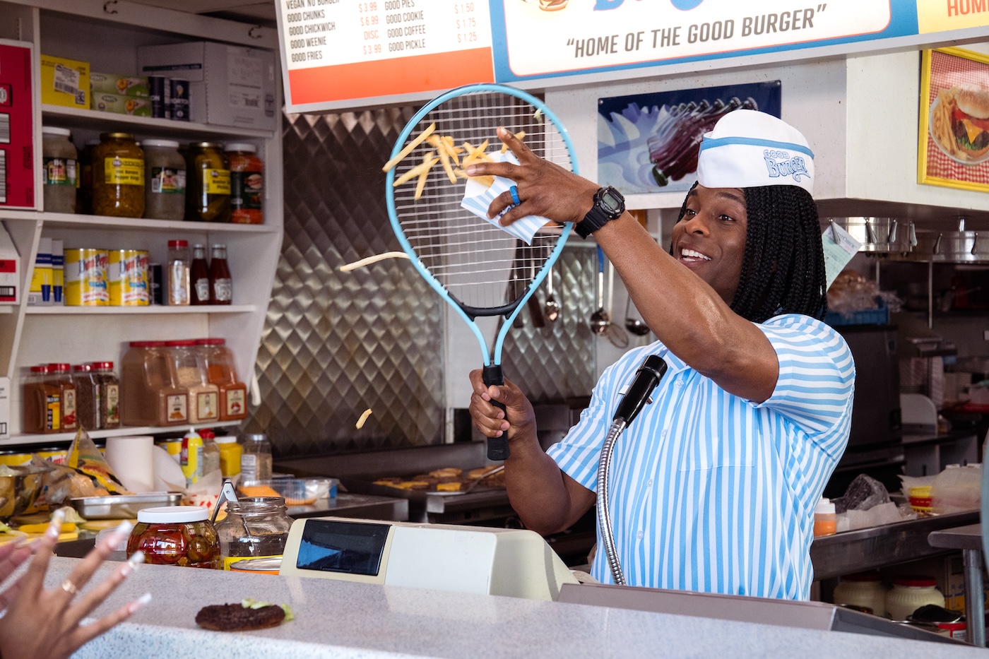
The approach for the sequel, as Hunter and Traill envisioned, was to pay tribute to the original, while still [somehow] elevating the new film. As Hunter adds: “We knew we couldn’t be cynical – approaching it with an elitist attitude of ‘We’ll make a better movie’ would be a death sentence. So, it was all about trying to capture what they did on the original while adding some modern polish that the audiences expect, with the technology we have today.”
In studying the original, Hunter felt it was composed of both intentional and unintentional techniques, probably arising from its low-budget nature and the fact that it was the director’s first film. “It’s sort of an odd task trying to incorporate mistakes or ‘things done in a rush’ into the style of this new film, but that was part of our mission,” he describes.
For example: in Good Burger, almost every angle is strange and unconventional. “We knew the camera had to be restless,” Hunter confides, “and if the shots ever felt ‘normal,’ we were doing something wrong. The look we ended up creating made every move difficult and a pain in the butt. But we knew we’d be doing the sequel, and its fans, a disservice if we did it any other way.”
As A-Camera/Steadicam BJ McDonnell notes: “Without the luxury of time, we would have to throw B-Camera into some weird place just to accommodate the A-Camera. Just by doing that, we stuck close to the original film, frame-wise.”
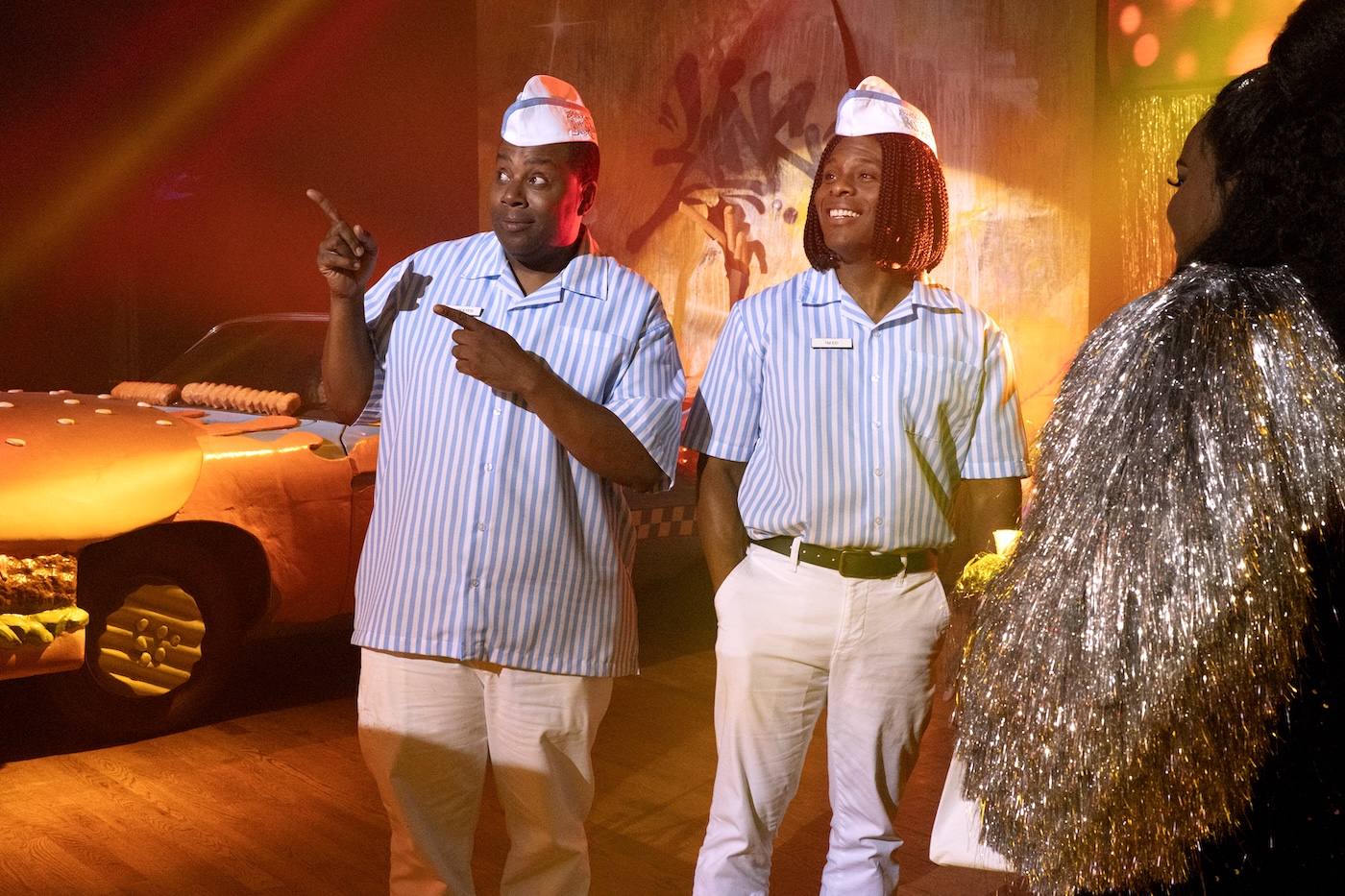
Putting the look together came out of testing, notably with 1st AC Zack Shultz. The one thing Hunter knew he wanted to do differently was to shoot anamorphic – with Sony Venice 1 and 2 and RED Komodo – and extremely wide-angle lenses, which included Atlas Orion Primes and assorted Panavision anamorphic zooms, primes, and fisheye spherical lenses. They even used an old Panasonic ENG camera, an S35 spherical 8mm Nikkor fisheye prime, and a Fujinon 19-90mm zoom for special shots.
Although Traill was onboard with the anamorphic, he thought the 2:4.1 aspect ratio was too wide. So, the compromise was 2:1, as done on Netflix’s hit series, Stranger Things. “We tested lots of different resolutions and anamorphic expanders to see what would work to ensure the lens covered and didn’t vignette horribly,” Shultz recalls. “When they decided to go with the 2:1 aspect ratio, we realized we wouldn’t need expanders, and even shooting 6K 3:2 on the Venice 1 and 8.6 3:2 on the Venice 2, there was little vignetting, except for some of our wide lenses”.
In the end, Shultz explains, “We decided to shoot 4K 4:3 on the Venice 1 and 5.8K 4:3 on the Venice 2, so we wouldn’t have to constantly change the resolution depending on what lens we were on. Or having to worry about punching in on the frame in post to hide vignetting.”
Shultz says the Nikkor 8mm fisheye lens was another fun (distinctly comedic) tool used for the POV of the Ed robot. “I put the lens on without changing the 2x anamorphic de-squeeze and, as I was going to change the setting, Jay stopped me and said, ‘Wait,’ this might just be wacky enough for Good Burger,” Shultz recounts. “’Let me send a photo of this to Phil,’ who loved it, and that’s the setting we ended up using. That was the moment I knew this wasn’t a traditional movie and embraced the silliness in front of, and behind, the camera.”
The movie is so wild, that it’s difficult to single out specific shots. Pretty much anything was fair game, with Hunter and his camera team striving to do each comedic “bit” in (or with the) camera and not with VFX – aside from a house being set on fire in the opening. “We couldn’t burn down an actual house, but we could use real flame throwers and smoke on set, which were then enhanced with VFX tools,” Hunter shares. “The comedy of the flame thrower bit was all from the Kennan’s acting,” adds McDonnell. “We had to hide the house in most shots and only shoot actors with flame throwers. All the shots of the house on fire were lock-offs. We actually did have a fake porch built with two mannequins we burned to a crisp.”
There’s also an out-of-control chase where Ed crashes into Dex. Hunter, whose mantra is always “safety first,” was concerned about protecting the camera and actors and thought about doing lock-off shots. But it didn’t fit the sequence. It was shot, as Hunter calls it, Buster Keaton style, on a real location in Rhode Island, with three cameras and careful coordination with the stunt coordinator. As McDonnell describes: “The stunt was broken up into a bunch of pieces. We did the typical three-camera hose down, which I believe most were lock-offs. However, I recall my camera not being locked off and tilting up with the stunt performer as he went up with the cables. Each time we did the sunt, our performer, with the violent action of the flip, would always break off the French Fry hood ornaments with his feet!”
One of the main threads of the sequel is “modernization” and how today’s new technology is squeezing out humanity and warmth. The film strives to juxtapose the old-world fast-food restaurant of human contact and service against a modern, sleek world of automation.
Hunter says that contrast was mainly achieved through lighting. “The ‘hero’ Good Burger set is a brightly lit space showcasing natural sources of punchy sunlight,” he explains. “We always used a lot of atmospheric haze to feel the burgers cooking off-camera. With the Mega Good Burger location, it was all about a non-organic, colder, almost inhuman look. More fluorescents and almost exclusively overhead light sources. We even covered the windows with gelled color panels so you couldn’t read the time of day. It’s more of a factory than a cozy burger joint.”
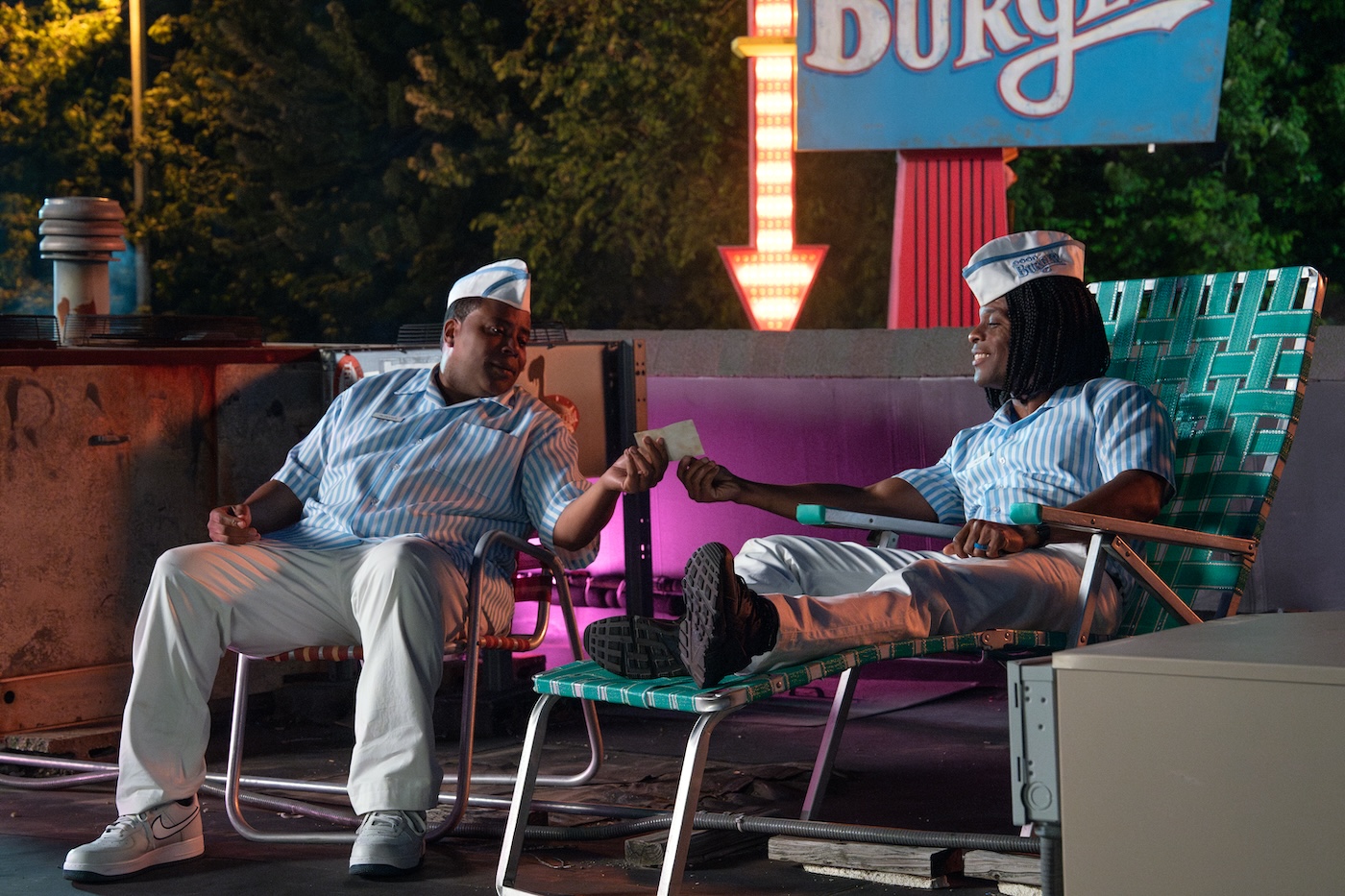
As noted, paying homage was a priority. Like a nighttime rooftop sequence that directly references a heartfelt moment between Dex and Ed from the original. “It’s not about slapstick and wackiness on the rooftop – it’s about camaraderie and friendship,” Hunter explains. “We went to great lengths to match the first movie. We fabricated a similar sign, created a pink light that we could dim up and down, and even have the same 3/4 back blue moonlight.”
The main difference was the technology used. Instead of having Condors with tungsten quartz lights (which Hunter normally prefers), planning for the weight limits, and the time putting a person in the Condor to make changes, the Condors were strategically placed with ARRI SkyPanel 360s that could be controlled via iPad on the ground.
“The rooftop location was fun but hard to get our gear onto,” adds McDonnell. “There was nowhere to put lens cases; every place we wanted to put the camera, a pipe or metal structure was blocking us. We had to get creative and use sliders and Apple boxes for each setup. We also had a weight limitation, so it was limited how many could be on the rooftop during the scene, and asking for gear that was not on the roof added time to an already tight schedule.”
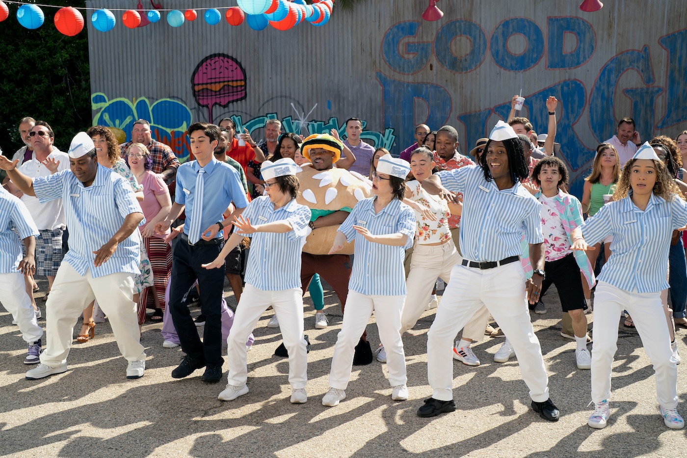
There’s another crazy homage to the original that caused a few challenges. It’s an outdoor music video dance sequence. “It was a typical Nickelodeon party scene,” remembers McDonnell. “A choreographed dance number with a musician named Yung Gravy [playing himself] as the DJ. Wide lenses to be up close to the dancers and actors using a crane to get the scope of the scene and handheld to get all up in there with the performance.”
The scene was shot in a parking lot, with people outside watching. “We first thought of lighting from Condors with fly swatters and 12-by-12 rags on the ground,” adds Hunter. “But to give us speed and flexibility, we ended up with 18K’s on roller stands and 4-by-4 diffusion frames. Our other challenge was that we could only shoot small wedges of the space at any time to sell the party. We would have loved to dolly the camera and pan around more freely. But location issues, extras, and other logistical restrictions didn’t allow that freedom.”
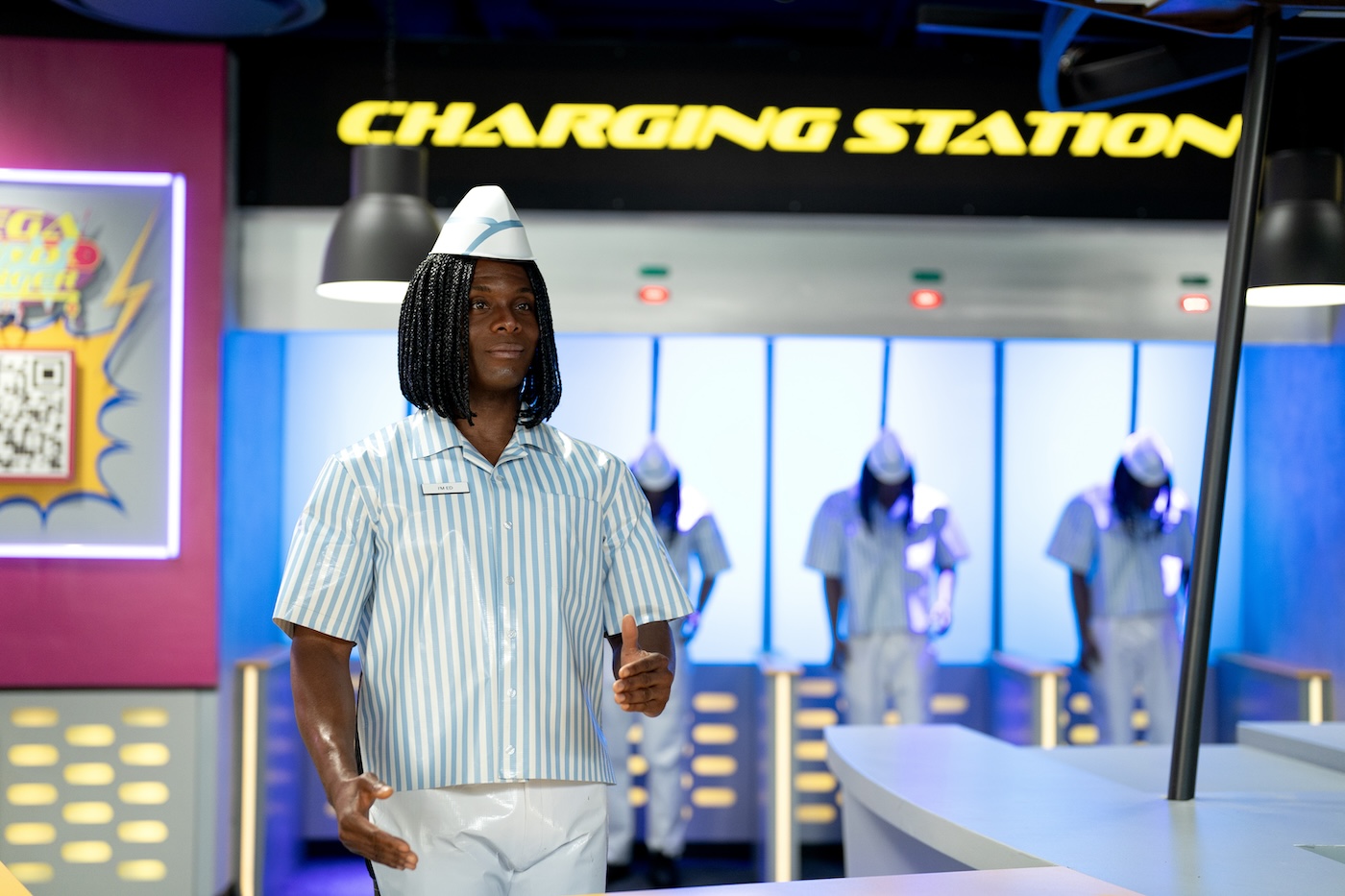
While there were many fun moments in the production, for Hunter, one scene that is pure slapstick fun stood out. It’s a traditional “in peril” moment where Mia (Kamaia Fairburn) is trapped on a conveyor belt (think Batman). However, due to last-minute technical difficulties with the practical effects, the entire sequence had to be re-staged and the camera team had to coordinate with VFX to make the “gags” work. Hunter recalls being “concerned whether our hastily changed plans would maintain the level of suspense that the scene needed, so at the last moment, I got the idea to use the color red to signify danger and blue to signify safety. That’s one of the great things about LEDs. You can change colors in the blink of an eye.”
McDonnell says the most fun he had on the project “was trying to figure out how to do cool shots quickly. Sometimes, when we would start setting up the dolly track, I could see concern with the AD and director that it would take too long [which it never did]. However, I saw this as an opportunity to show them how to hard-mount the Steadicam on the dolly and roll freely without setting up a track. We could go from low to high mode easily, allowing us to do interesting shots, faster. I had a fantastic dolly grip, Rob Kelly, and first AC in Zack Shultz. Sometimes, due to the tight schedule, we just had to wing it.”
Like a scene with a car doing multiple doughnuts on a playfield, where McDonnell says he worked closely with the stunt coordinator to ensure his camera distance was safe. “Honestly,” he laughs, “I think the most dangerous stuff on set was the ‘Ed Sauce’ that got sprayed all over the place. Our B-Camera 1st AC, Jamie Fitzpatrick, absolutely hates condiments, and there was a scene where the Food Dude gets turbo-sprayed with a legendary amount of Thousand Island dressing. Jamie’s reaction was priceless.”
As Shultz adds about the condiments mayhem: “We covered the cameras as best as we could and put clear filters in front of the lenses. The actors got so hosed down the sauce went everywhere, and our cameras and operators got sprayed too. Thank goodness we covered everything, and our great second ACs, Tom Bellotti and John McCarthy, did the hard work of cleaning our gear up after. There was no way Jamie and I could do it without throwing up.”
The AC also cites a technical gag involving a Counter-Zoom-Dolly move or what Hunter called a Vertigo shot. “This is when you push in with a dolly as you zoom out on the lens,” Shultz continues. “We used this shot right before Ed hits Dex in the Burger Mobile. We probably pushed in on the dolly around 30-40 feet as we widened from 500mm to 50mm to keep the same frame around eight feet from Dex. There wasn’t time to lay down marks and have them called out to do such a hard-focus pull. So, the Preston Light Ranger became a lifesaver. I have been using it for many years, and often I use it like a Cine Tape, or I don’t use it at all and certainly never trust the autofocus function. But with only one rehearsal for that scene, I thought this was what the Light Ranger autofocus was designed for. And it worked out great.”
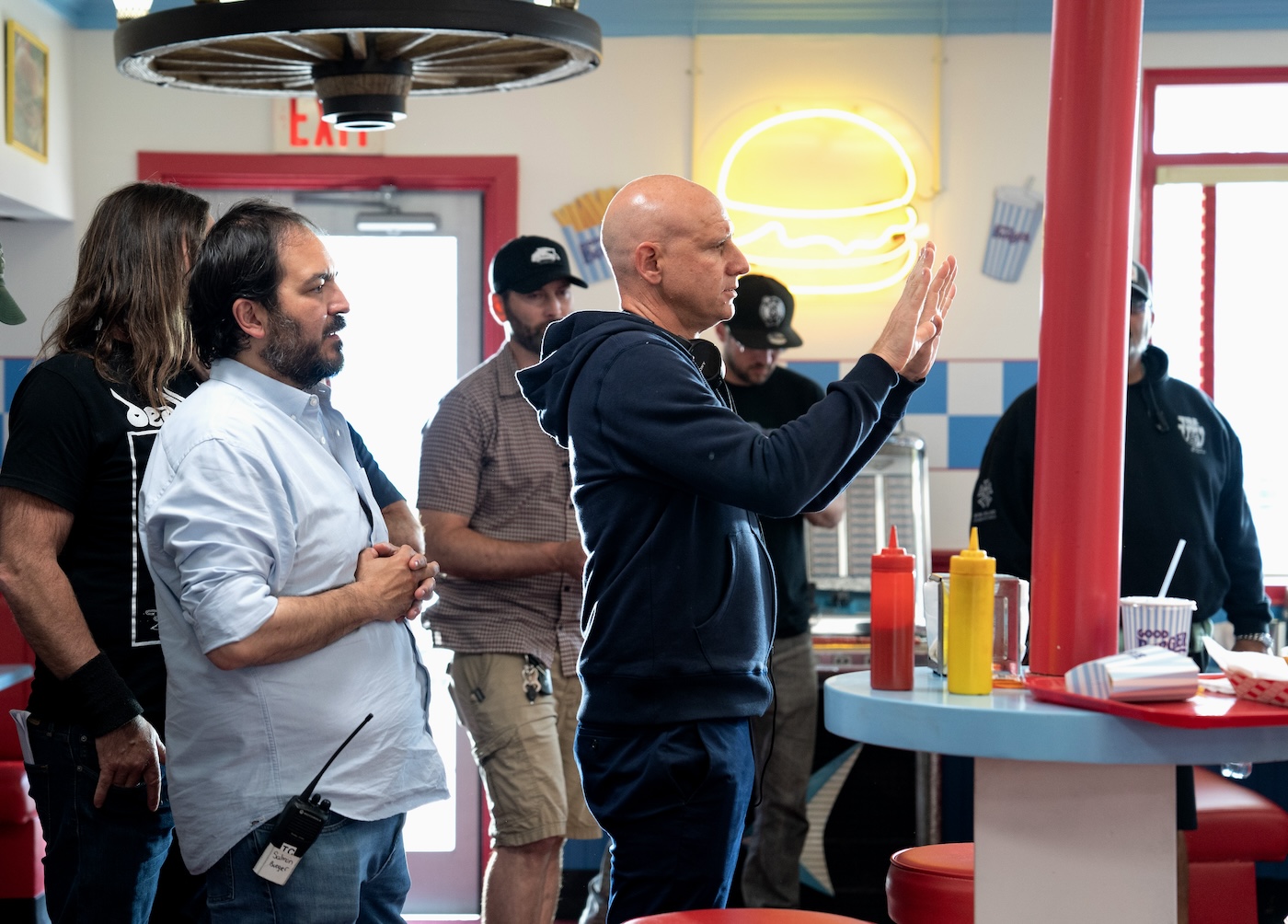
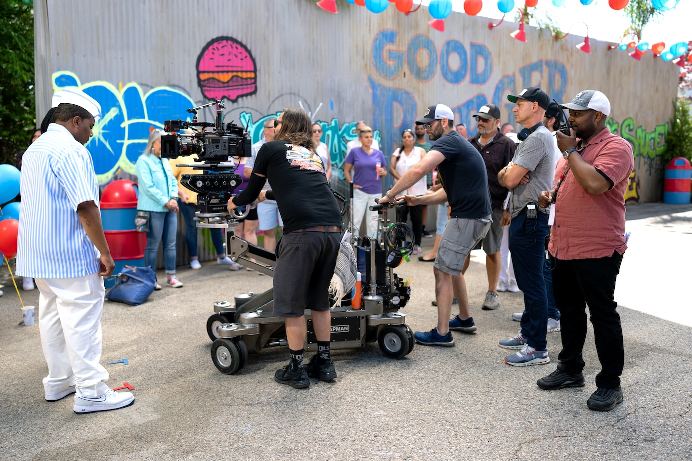
Good Burger 2 – Local 600 Crew
Director of Photography – Jay Hunter
A-Camera/Steadicam Operator – BJ McDonnell
A-Camera 1st AC – Zach Shultz
